The Unending Square: Disjunctions and Cospacing for Coworking
M'Arch #4 Architectural Design Thesis (Part 2 of 2)
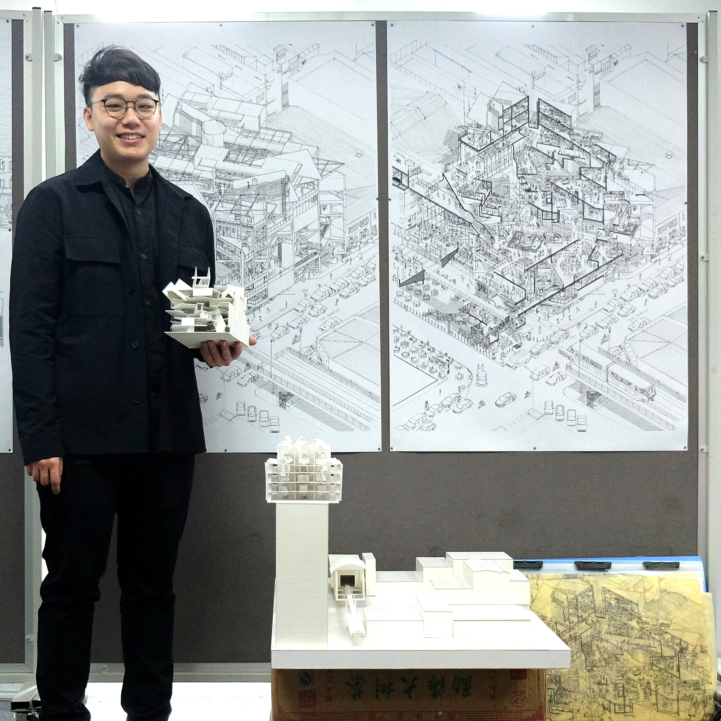
This is a continuation of the thesis project for M'Arch Semester 4 at Taylor's University. Part 1 of the Thesis here!
The Unending Square
-Disjunctions and Cospacing for Coworking
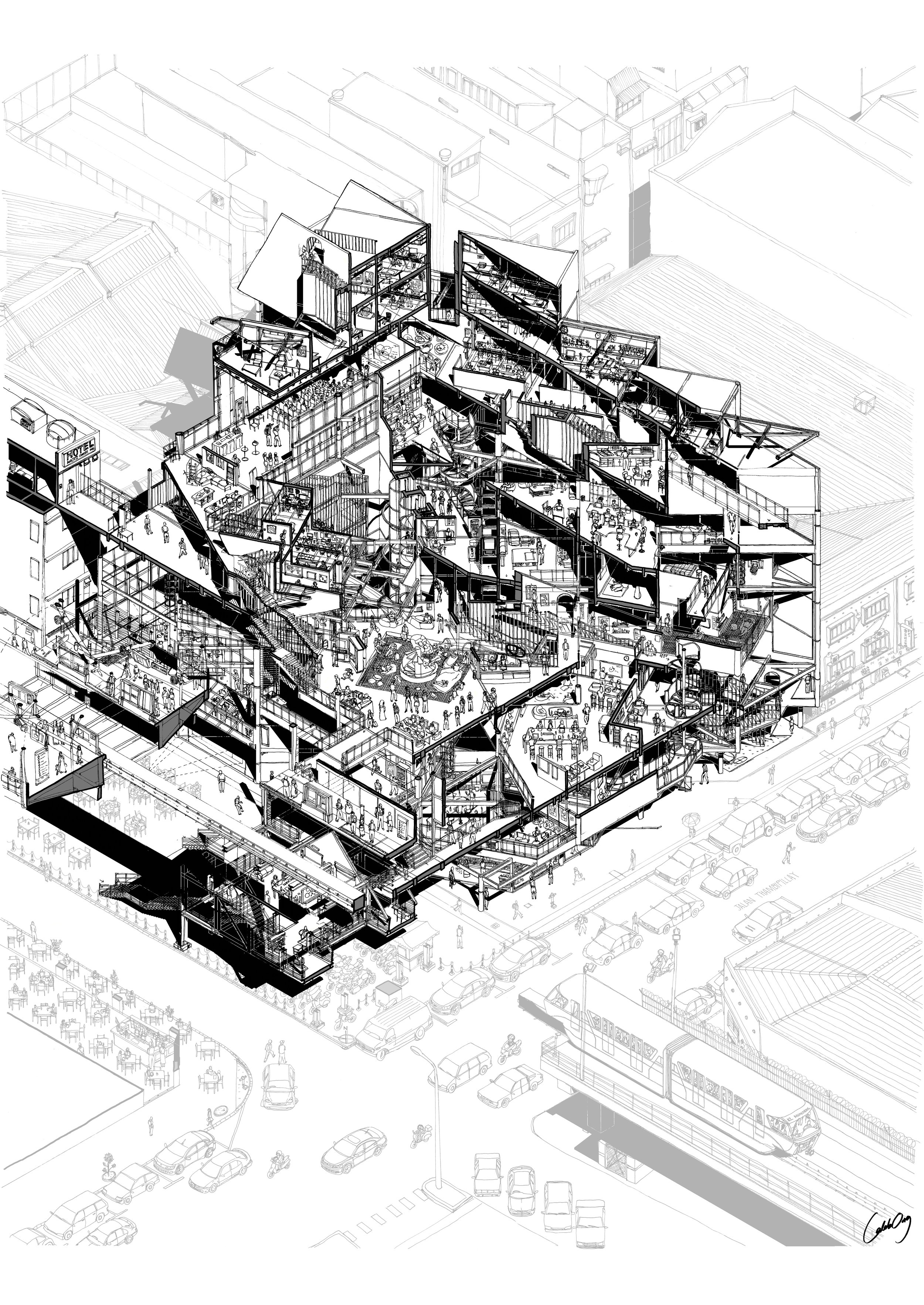
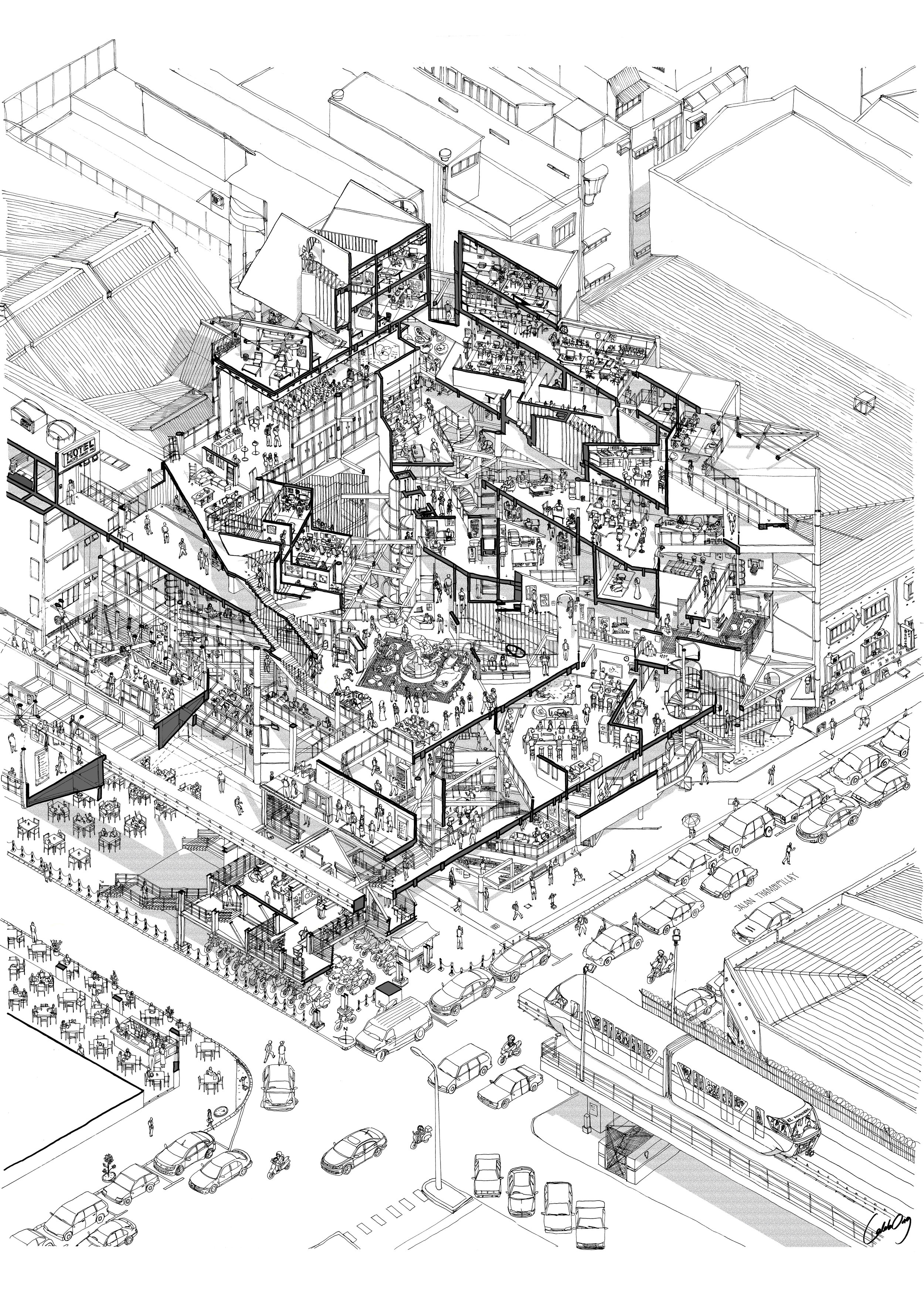
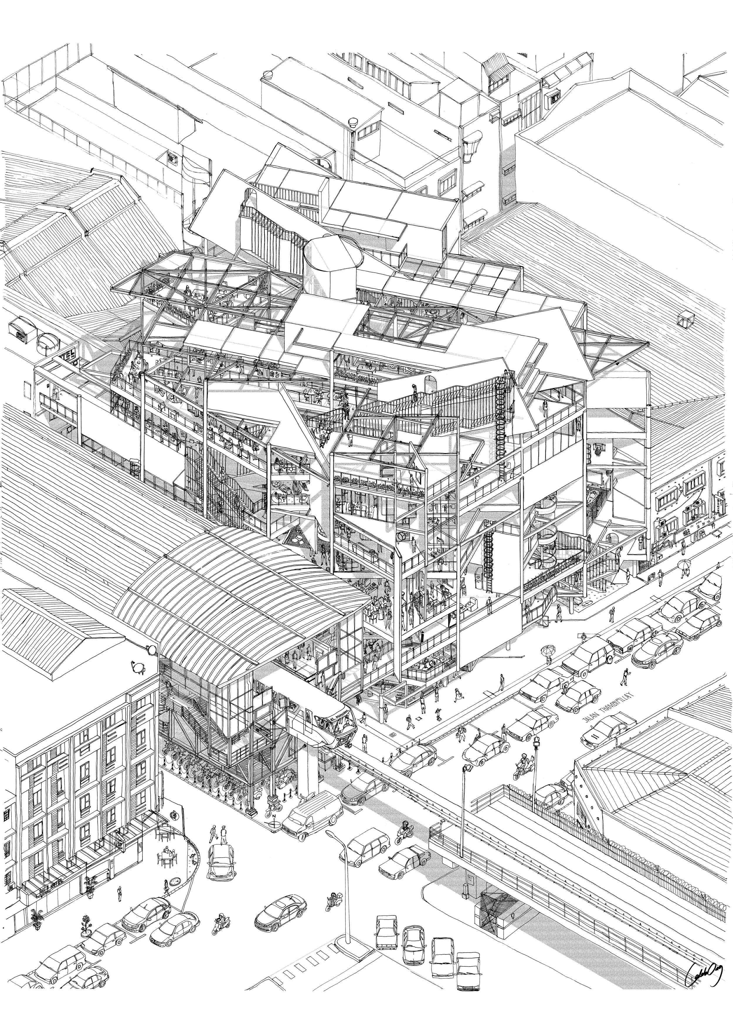
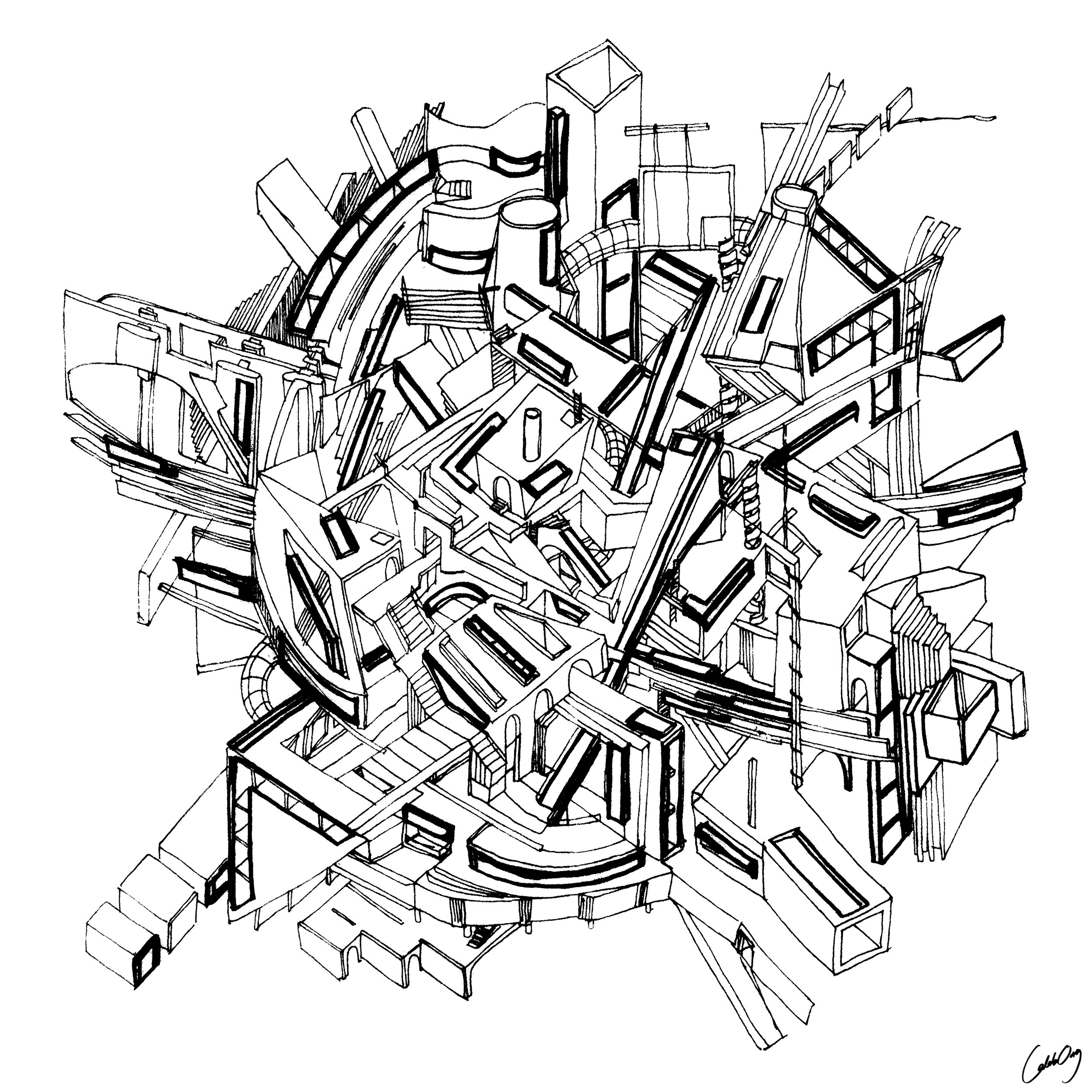
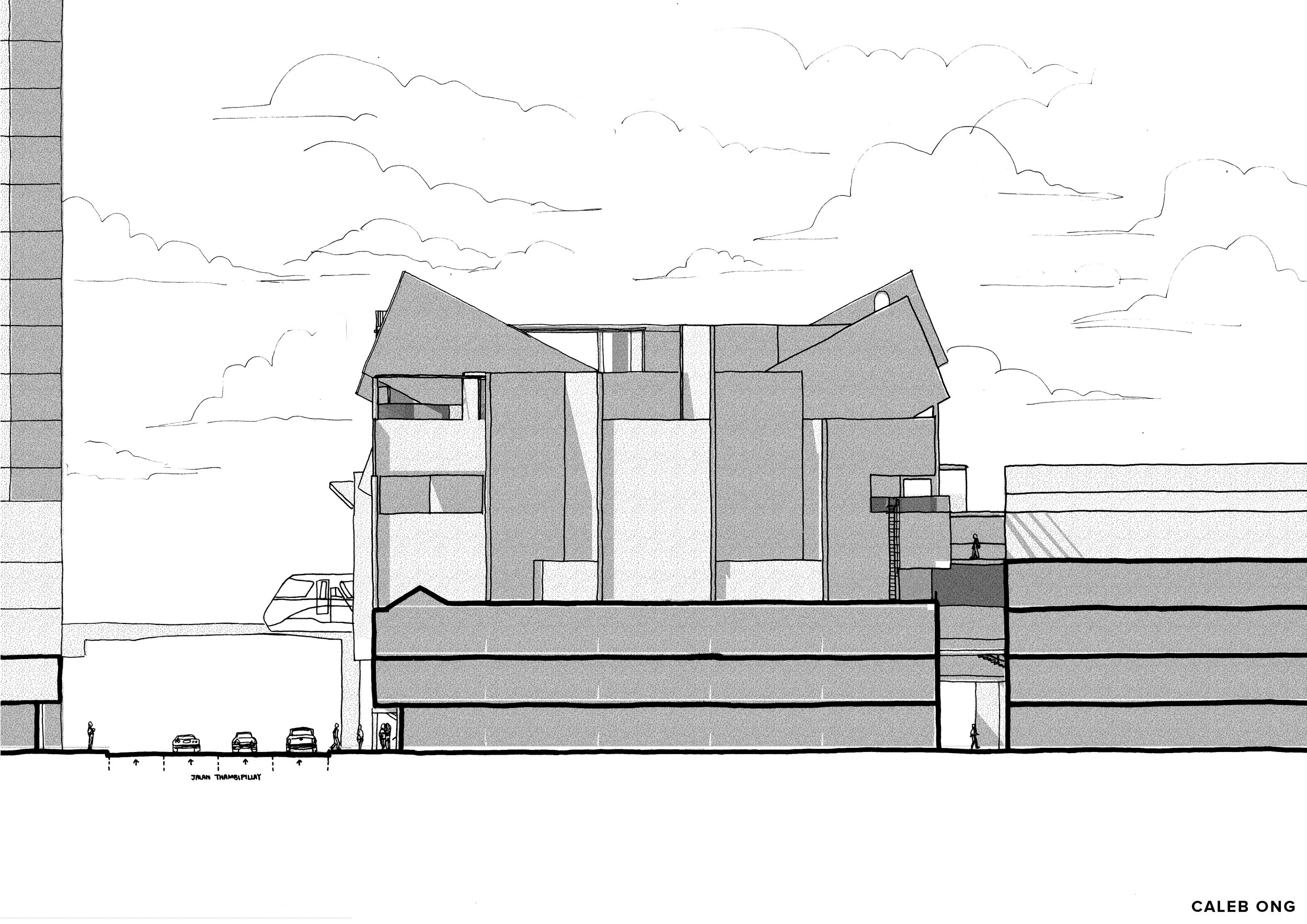
The world is experiencing a shifting work-life paradigm with the rise of coworking spaces and the number of creative class who choose to work in them. The coworker community operates as decentralized workforce rather than following a hierarchical organization, with a certain degree of disjunction presented and desired between the events, space and movement and the readings of undefined coworking spaces. No-sentral, a coworking project proposed across Nu Sentral amidst the dilapidated shophouses of Brickfields as an extension of working network across Jalan Tun Sambanthan away from the 24 office and residential tower blocks of Central Business District KL Sentral. The site is surrounded with 24/7 amenities and great accessibility to public transportation and working opportunity.
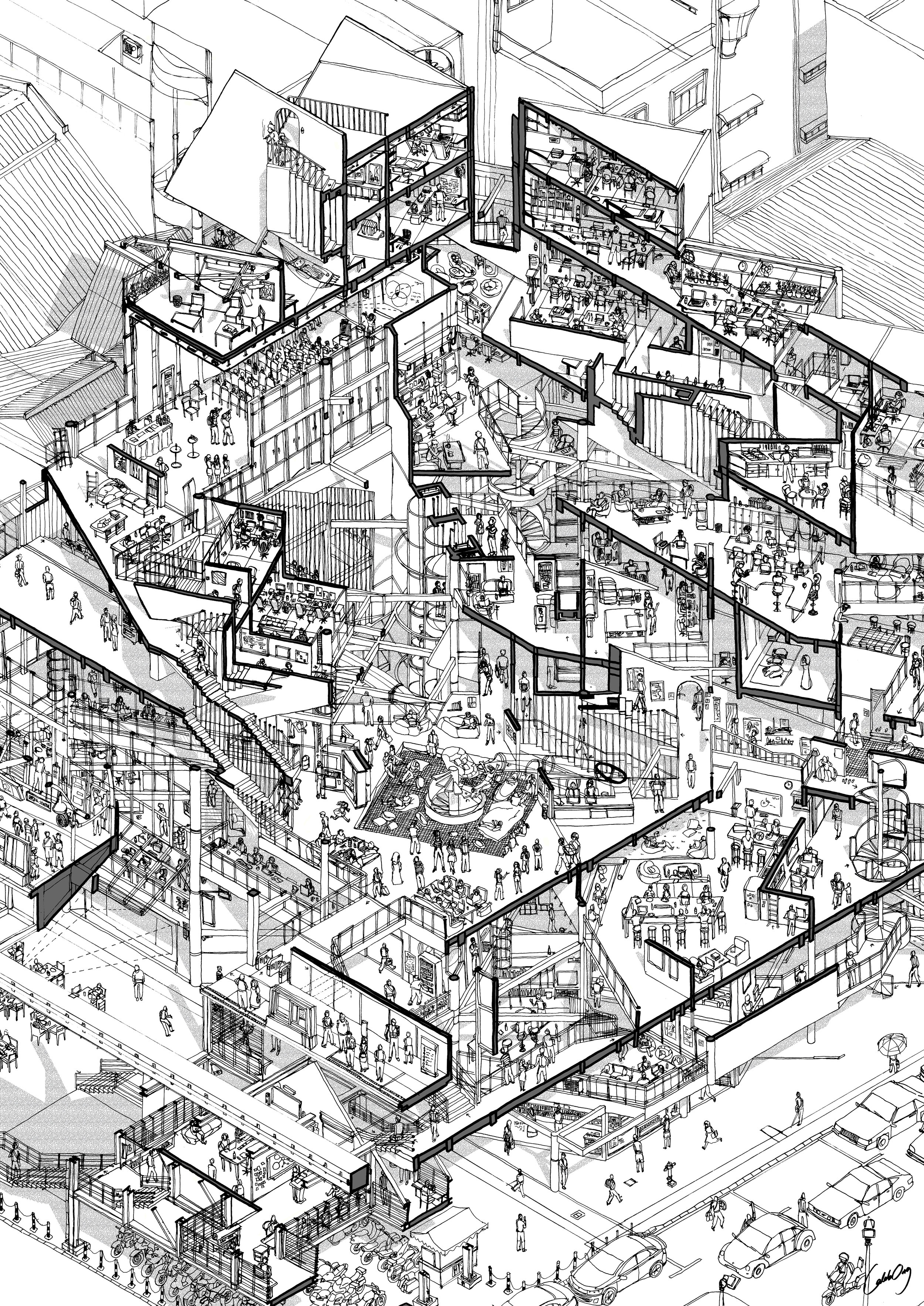
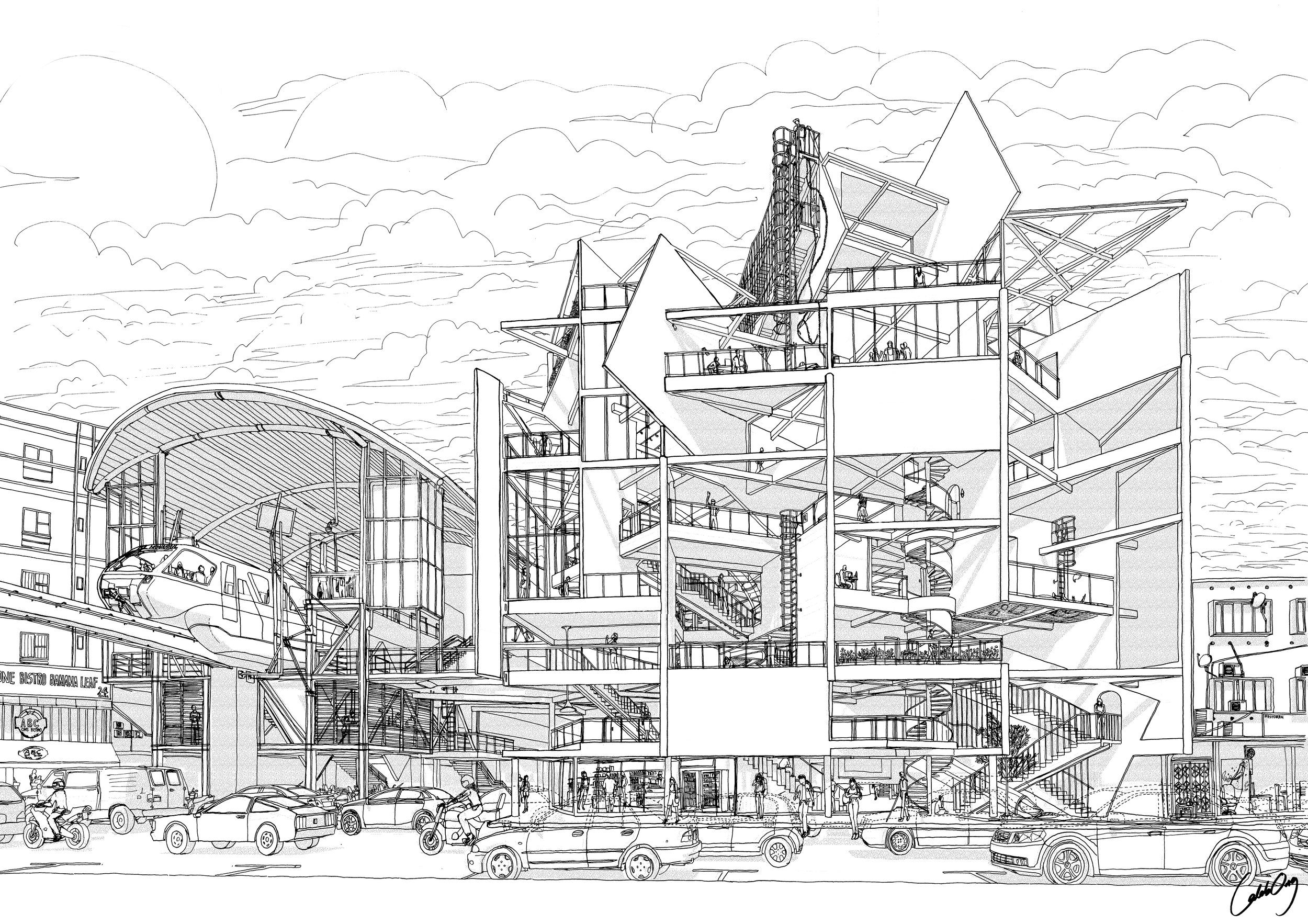
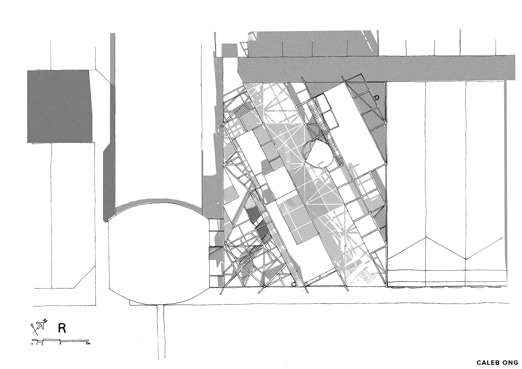
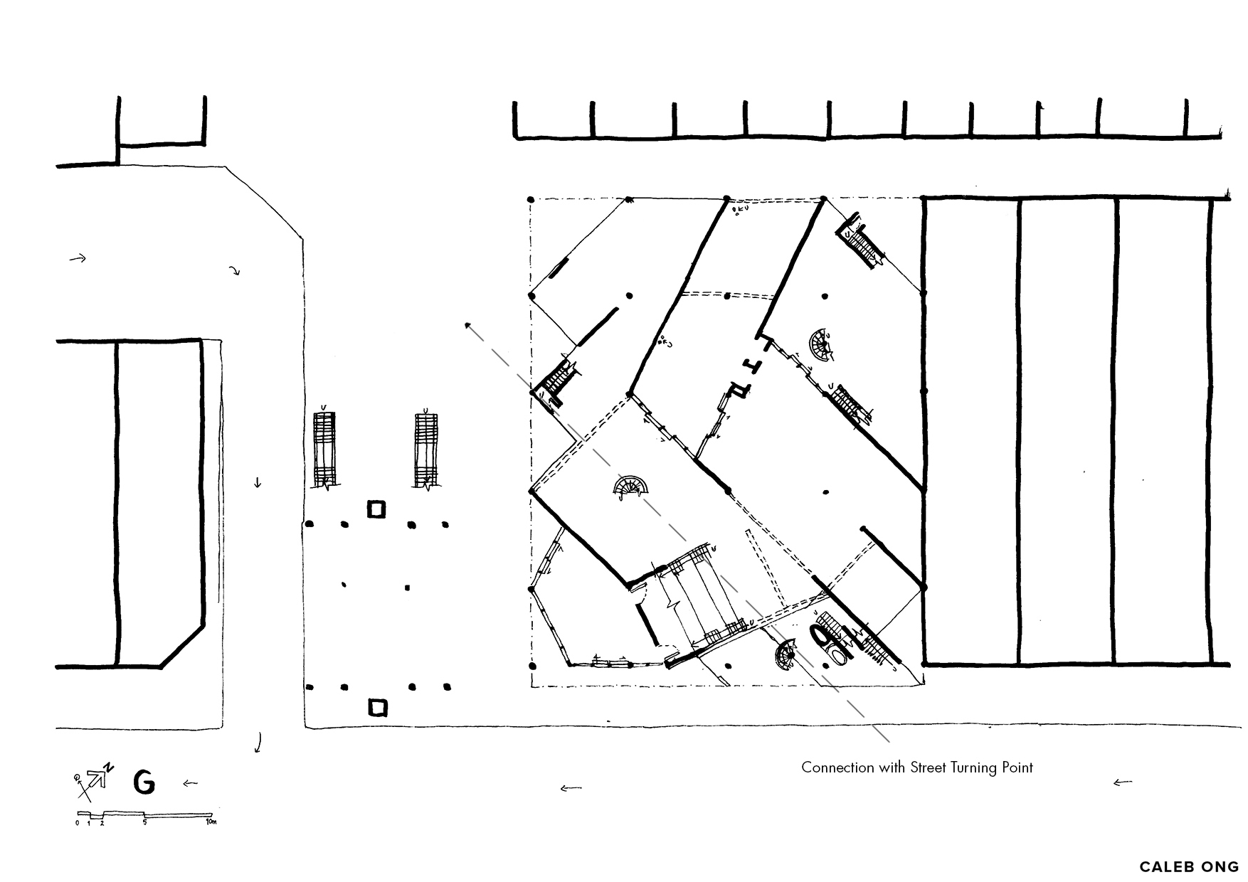
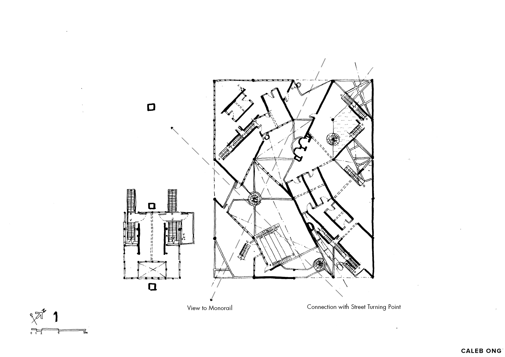
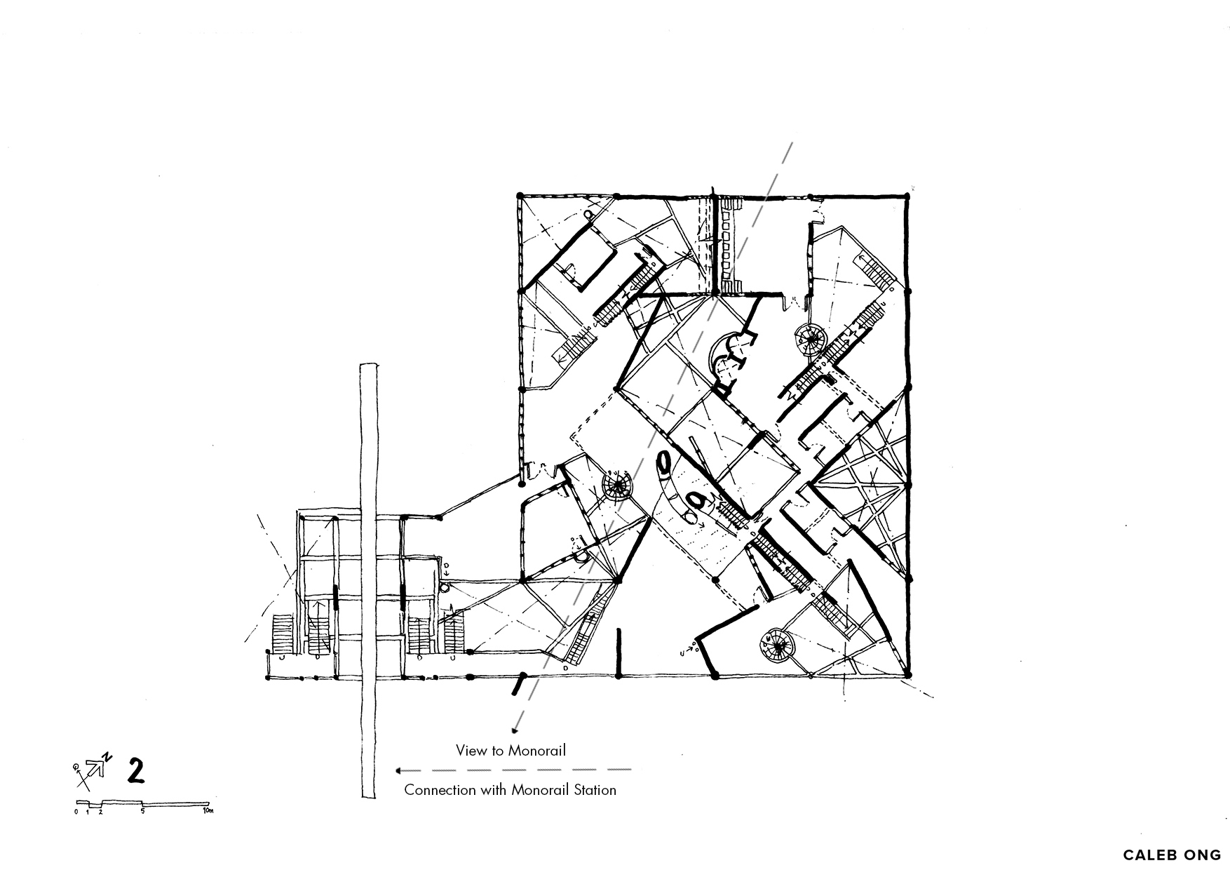
In references from theories devised from Tschumi’s architectural disjunctions, real and fictional architectural elements of events, space and movement with a varying level of Visibility and Accessibility are disjointed and alternatingly distributed across the building without a main central point and a clear hierarchy of space; to reflect the organizational hierarchy of the community. It encourages and allows the workers and visitors to move and hot desking around different part of the building in different time of the day to either have a ‘fresh start’ or have a clearer view and be familiarized with the surrounding, thus creating unintended encounter and dynamic interaction within the coworker community. The building established itself as a game of snake and ladders, with its unending circulation filled with alternating program, alternating accessibility, varying space conditions, multiple entry/exit point that provides coworker a game of choice towards an undetermined daily routine and events.
The thesis investigates the limit of Tschumi’s architectural disjunction in providing a multiplicity of readings in fictional and reality to create dynamic movement and interaction in the contingent of coworking community that drives change, embraces organised chaos, uncertainty, and has a high demand for humans’ interaction amidst the diurnal and nocturnal coworking community of sharing.
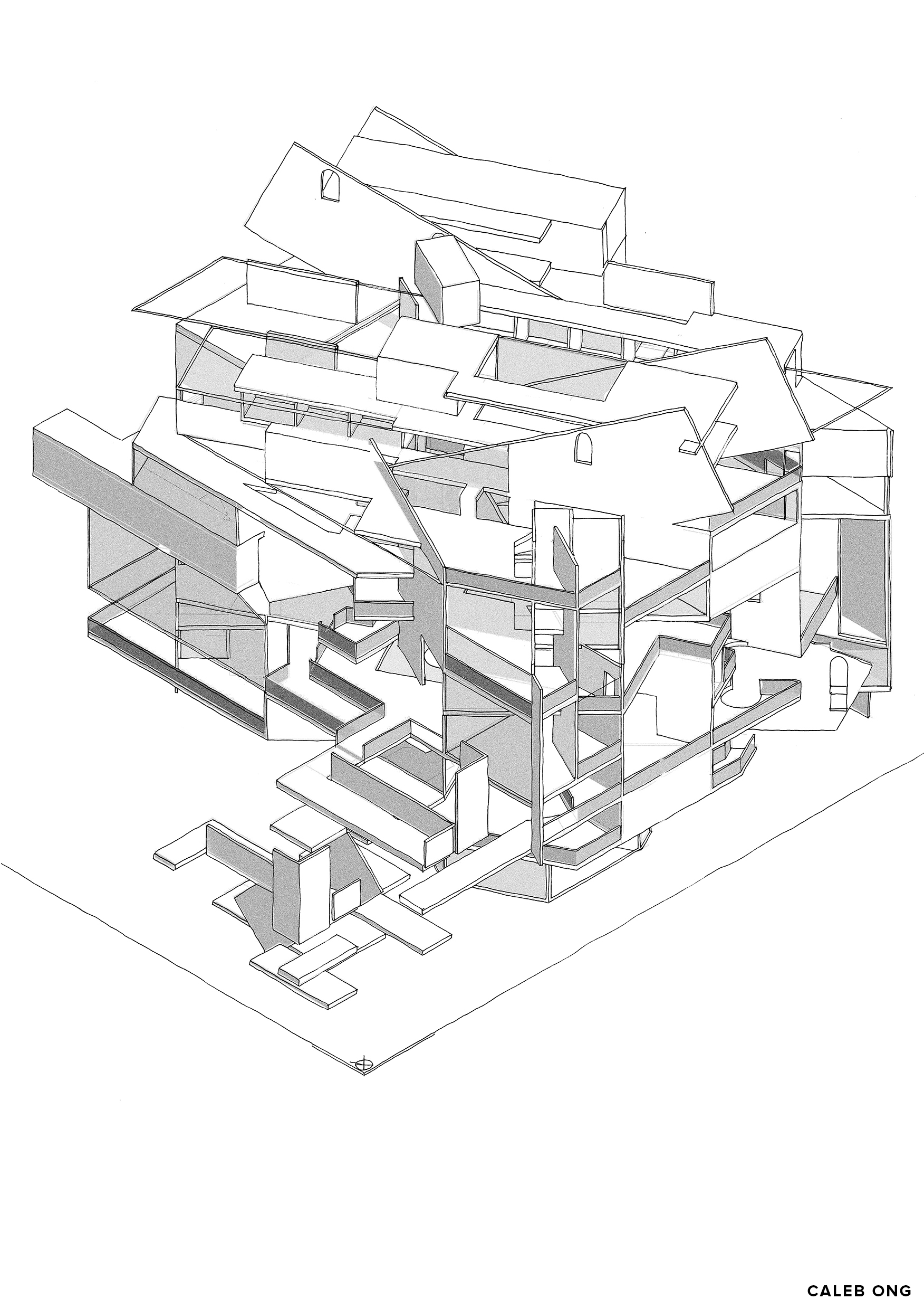
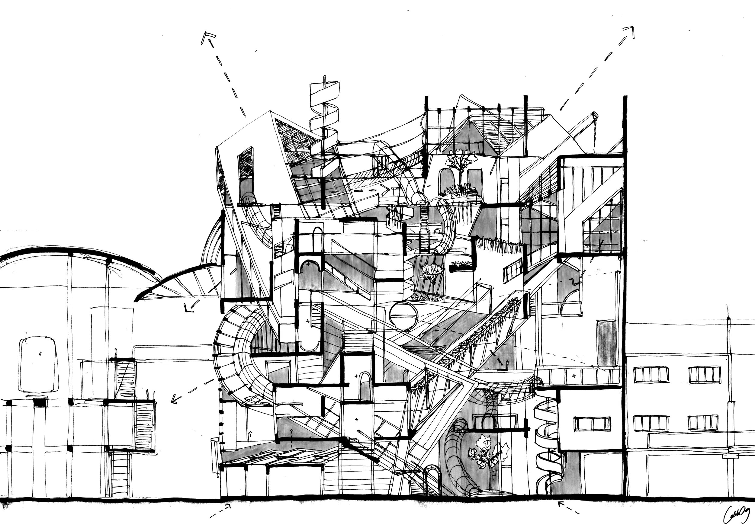
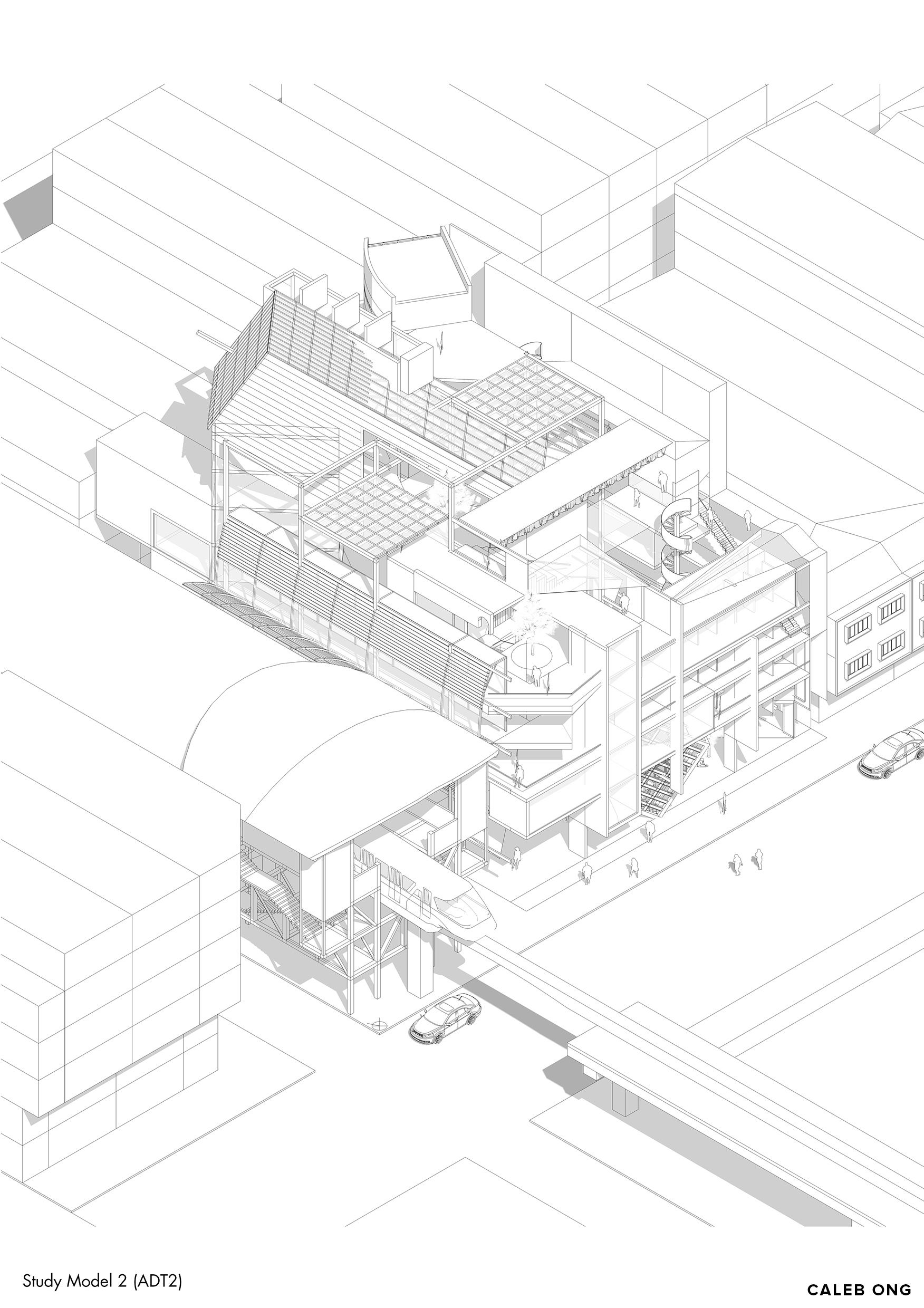
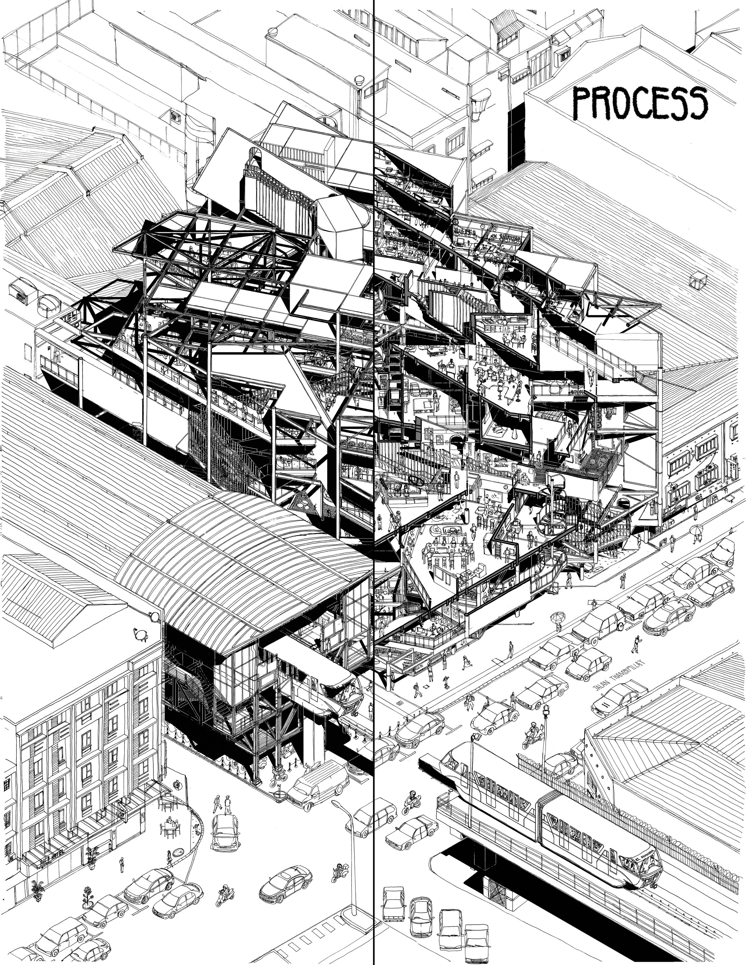
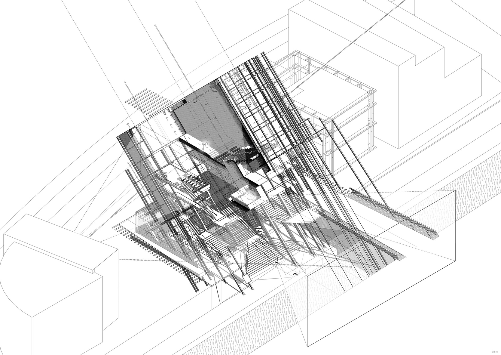
Isometric Cutout
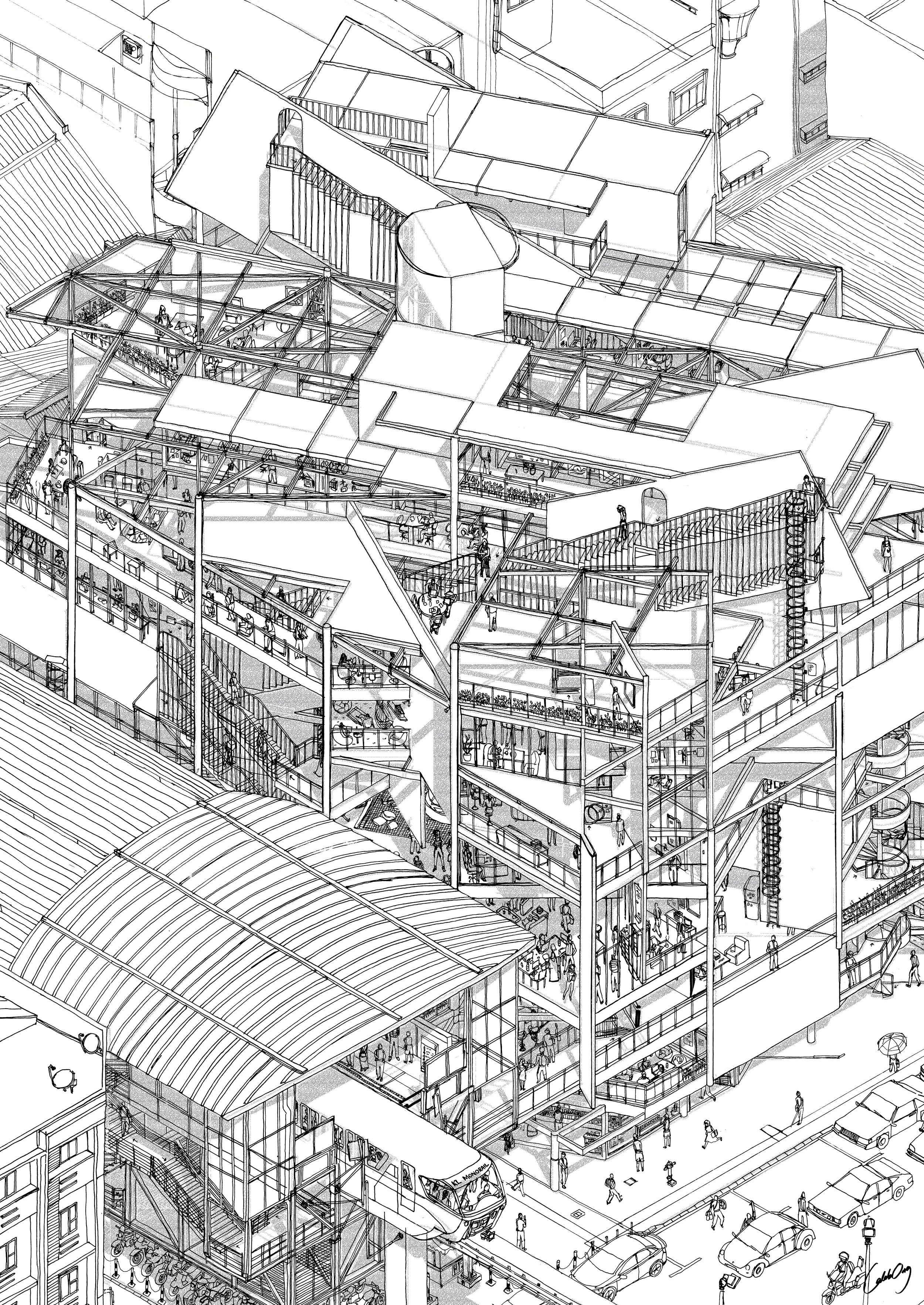
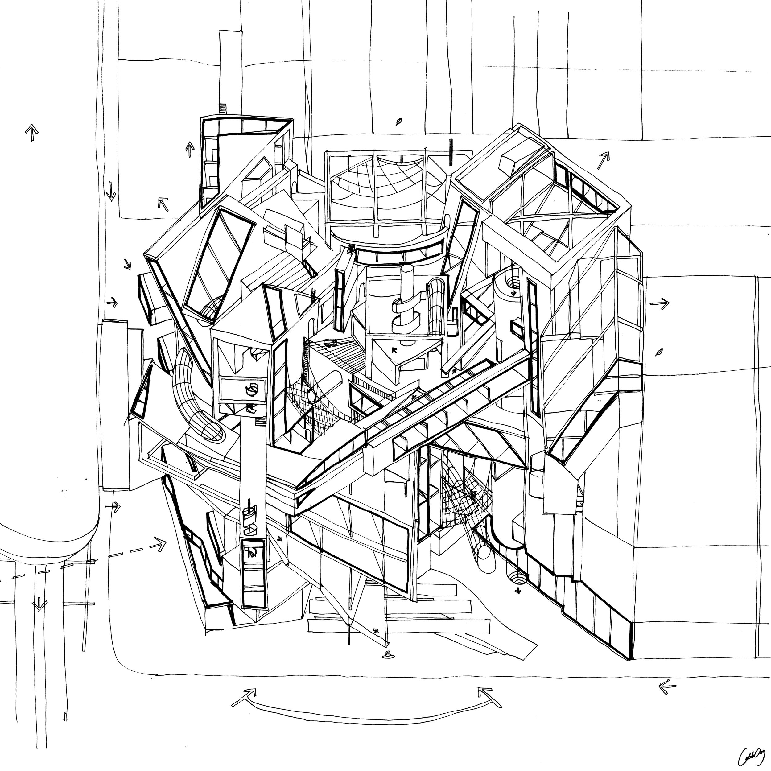
Isometric
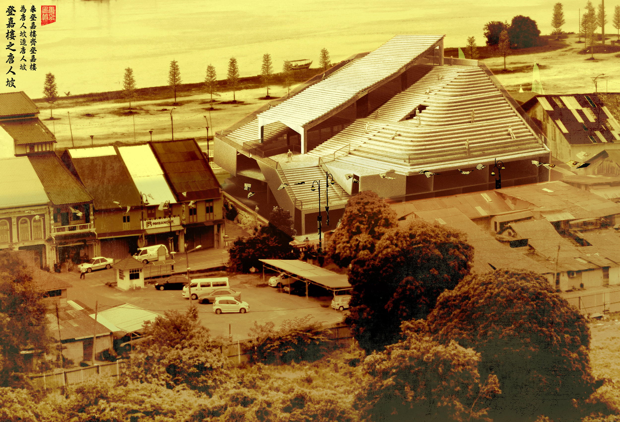
Street Perspective
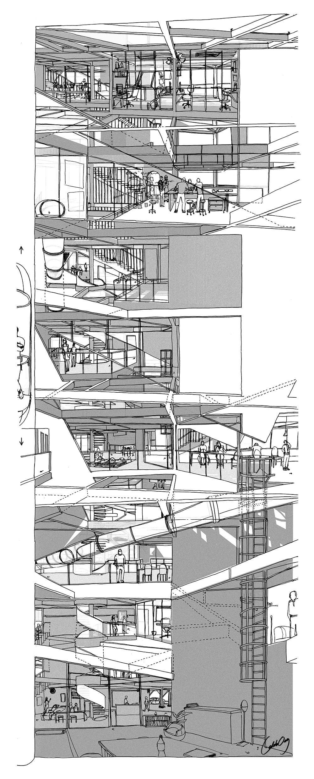
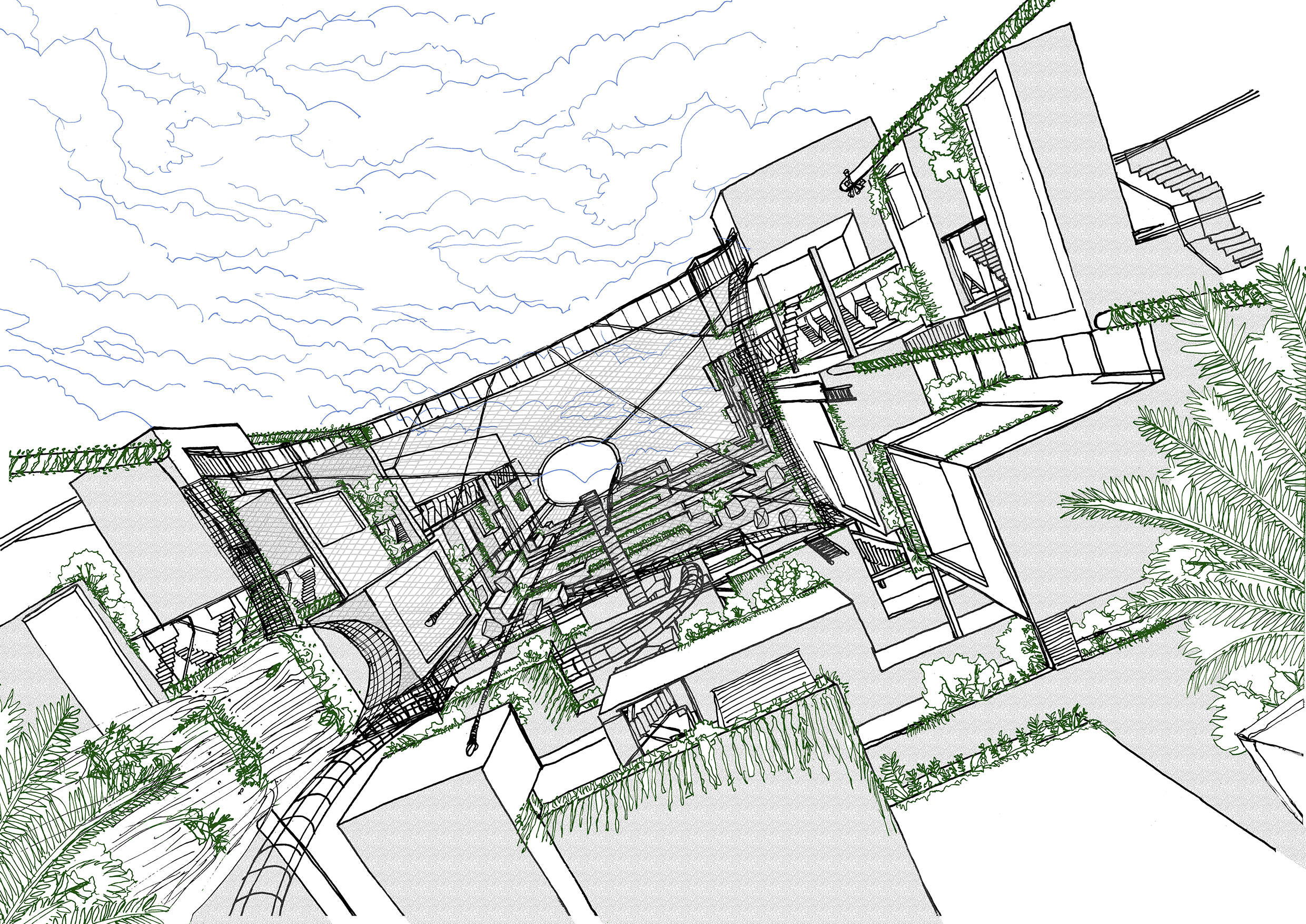
View out from the elevator (Vertical Movement)
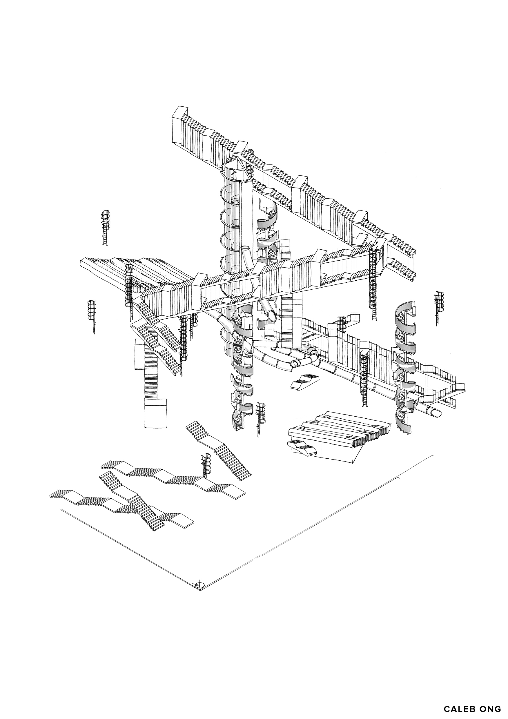
In-accessibility (Junctions)
Order among Disorder
-every slanted element shown in elevation is a sign indicating the presence of a staircase
-slanted element in elevation and section improves multiplicity of reading (unpredictability/un-determineability) as its positioning “moves” across different planes. (refer to the sections and floor plans below) The configuration of stairs is configured to have the highest unpredictability/un-determineability, maximum varying level of privacy and ‘choices’, and are oriented towards either one of the most logical and workable axis.
-to have alternative entry/exit point, open staircase and fire staircase is stacked above each other and alternate accordingly
-it is either is fully covered in fire protected corridor, or open to outdoors or open courtyard
-just as how much railway/road/transit intersection presented on the site of central business district kuala lumpur, the signs of accessibility sometime do not entirely indicate high accessibility.
The presence of these sign of accessibility at times actually indicates otherwise; the lack of accessibility of the place itself, as it overly suggests moving, and do not necessarily encourage pauses and people to stay, disrupting the local node of traffic.
-these signs of accessibility plays a big part into providing a “sense of play” on the static workplace, as its presence itself created a fictional mental construct of high accessibility among the community and spaces. All the circulation in the building is intentionally designed to ‘force’ the user to join the ‘play’, and as part of the show as they traverse across multiple spaces and coworker’s sight lines, similarly to the game “snake and ladders”.
-the large continuous open stairs have high visibility across multiple alternating spaces built upon T3:Perceptual Reading frame 4/5 up for people to derive meaning upon the type of traffic and event happening upon it.
In-visibility (Disjunctions)
Disorder among Order
-the building is certainly not for everyone and anyone, it is for the community of people who wish to have varying daily routine and have varying desires to have control on the level of privacy, engagement and environment on a hourly basis.
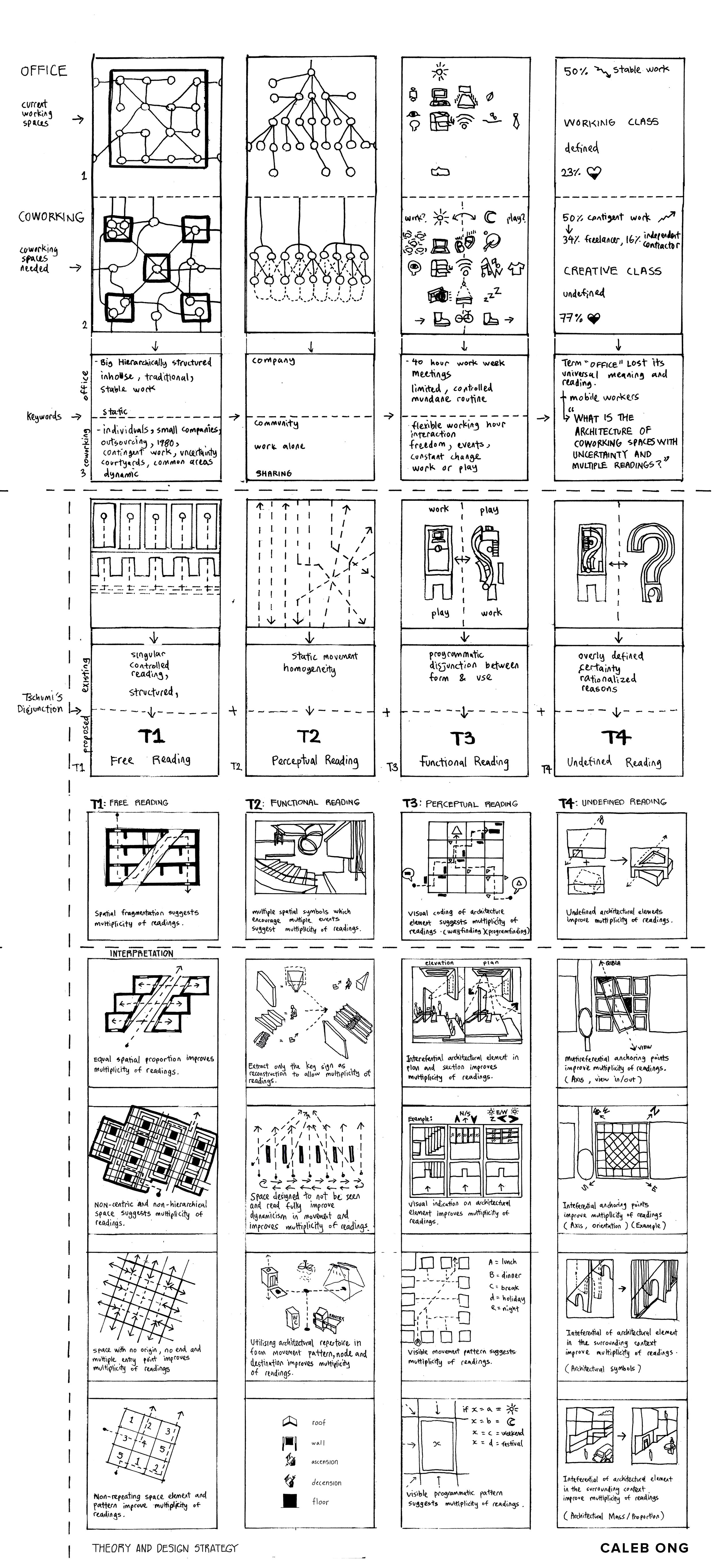
-the architectural planes (wall) is arranged in a way that provides the attributes of T1:Free Reading frame 4/5, and T2:Functional Reading frame 3, so that there is not a central space for the building, reduced hierachy of spaces and every spaces having varying condition/opening for its own meaning, program to be created by the user.
-existing coworking places usually have an open plan with spaces that are easily understood, you either get a sense of belonging to the place or you don’t, and once you do not feel belongs or get discriminated, you have no where to escape within the place. This scheme provides many optional alternative spaces and encourages changing of hot-desking location on an hourly basis every day.
-the planes were also arranged in a way to have well distributed conditions of space (opening, void, opacity) to have equally distributed and alternating space suitable for fixed desk area, hot desk area with varying proximity to facility space, utility space, common space and event space. (as types of program is suggested/restricted by the space condition. But who knows, maybe someone would like to have event on a narrow hot-desking corridor? have facility scattered across corner next to fixed desk area? or hot-desking zone occupying the common area?)
Theories
derived from ADT1 (first half of the thesis)
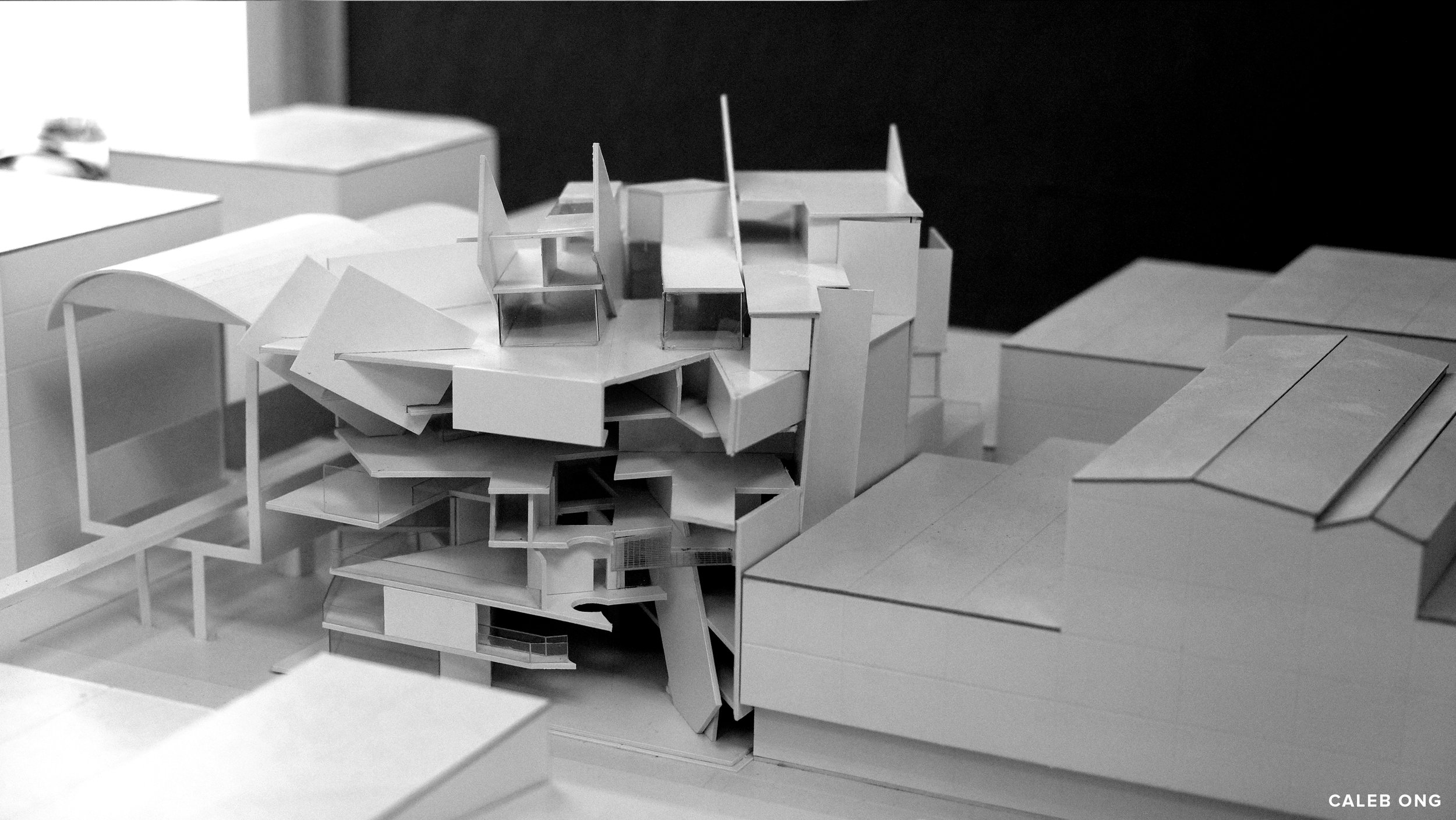
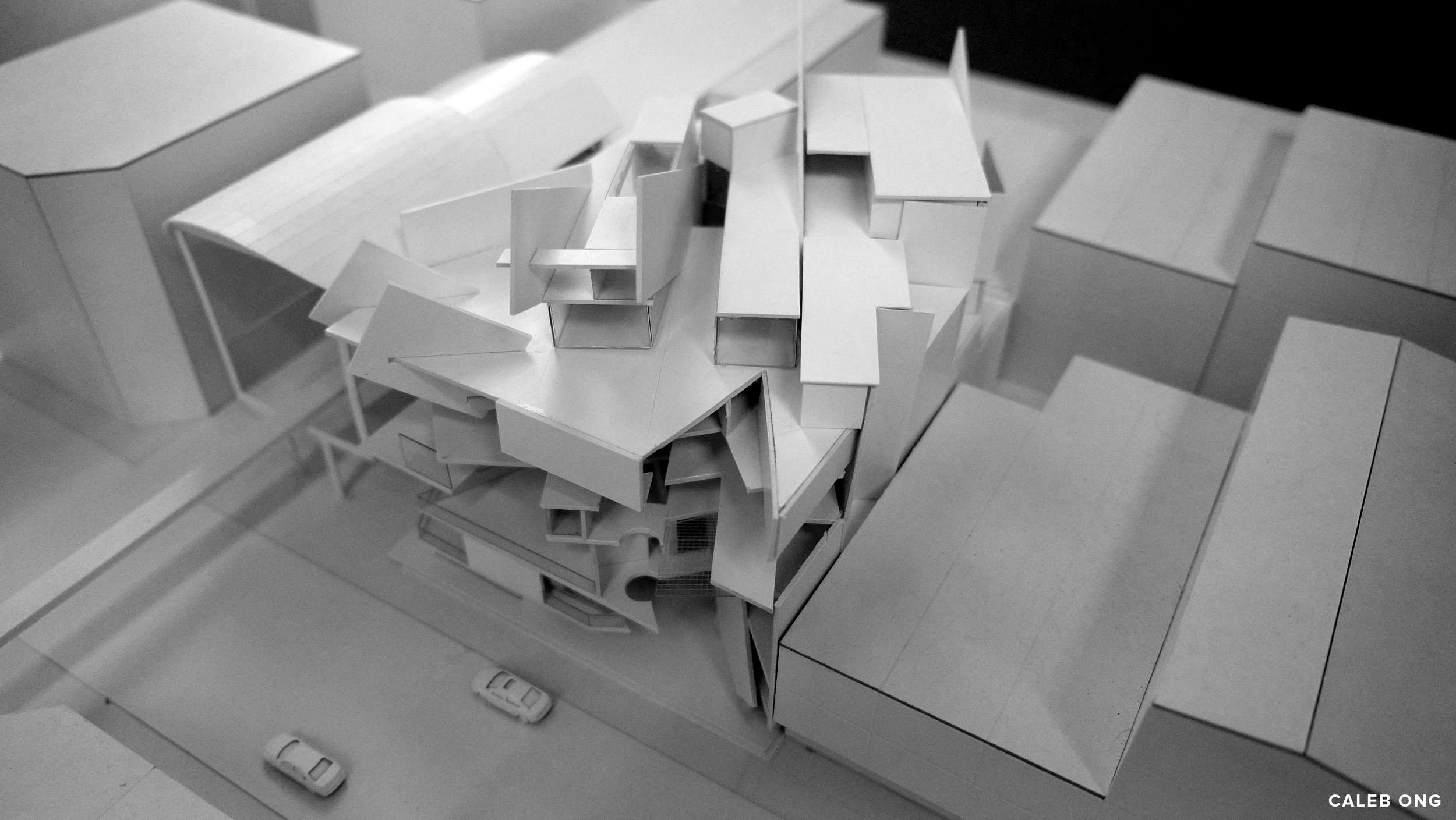
Design Model
Design Model
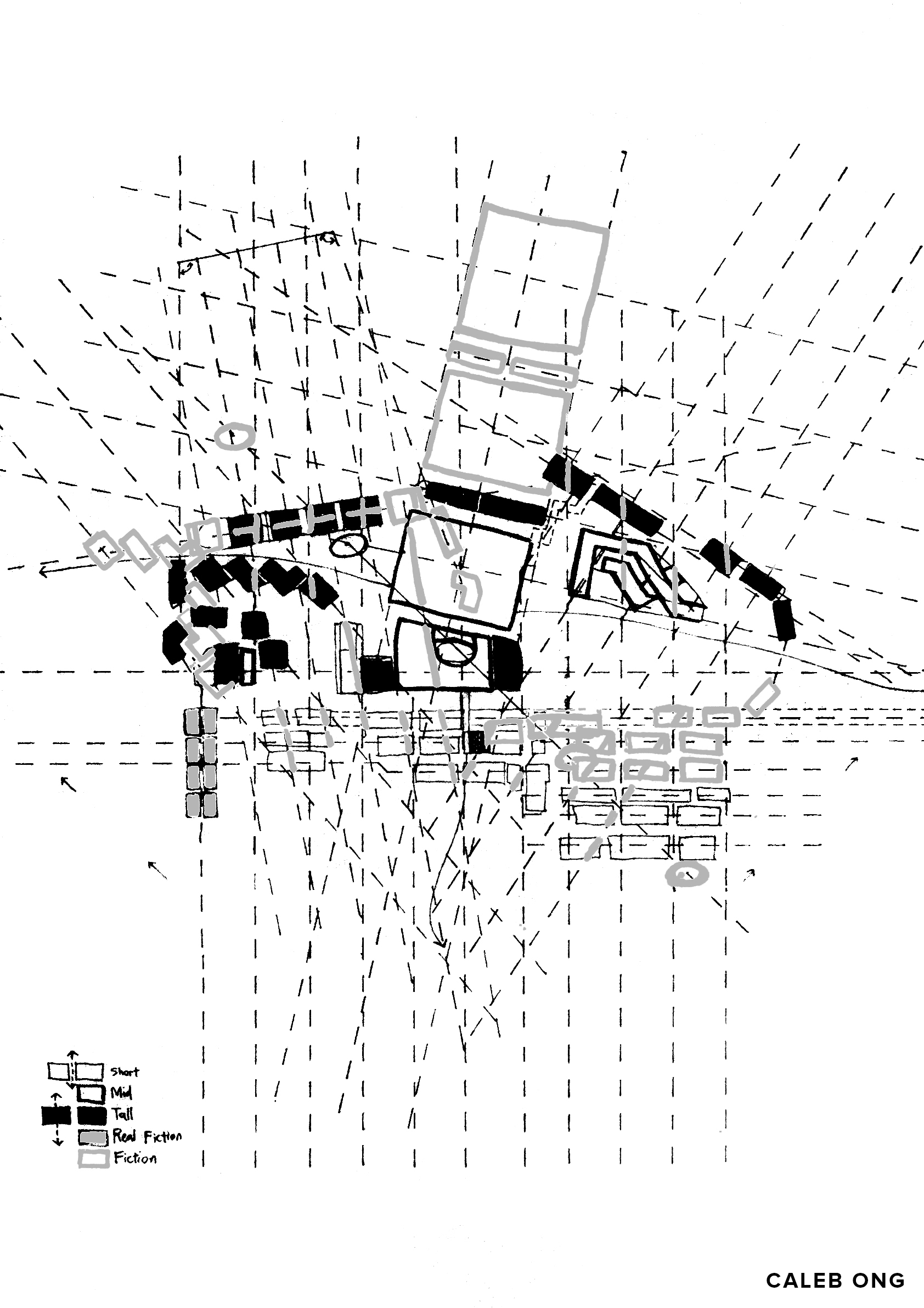
Design Sketch 1
Apart from having spaces in equal proportion (outcome from ADT1), is there any other way to achieve the same outcome and objective
Design Objective:
-To have no clear hierarchy of space
-Impossible for a clear view of spaces
-Alternative circulation and accessibility
-Inter-referential architectural elements
-unpredictable overlapping of spaces and circulation
Design sketch 2
Expanding on design sketch 1, design sketch 2 explores through an isometric view, being drawn onto site. Design logic started to be developed that corresponds to the site and the program, with similar strategies and intentions presented in design phase 1.
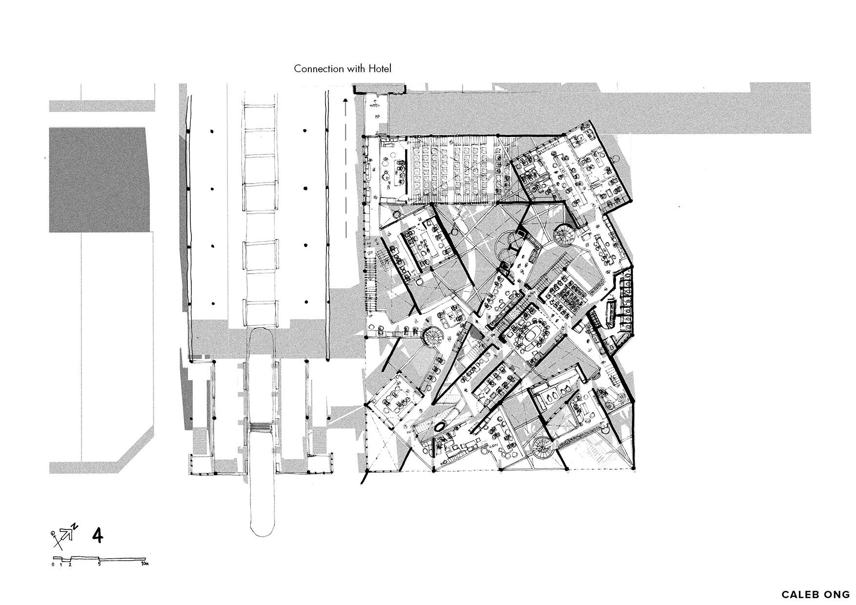
All design sketches are explored with the intention to connect with the monorail station and a hotel adjacent to the site.
*the adjacent Monorail Station marks the start and the end of the Monorail line. Thus, the disturbance and noise/sound of the monorail traveling isn’t the highest it could get. The sound of highly congested vehicular traffic around the site instead produced a background ‘music’ consisting various busy city-work sounds at its time of the day, providing hints of external reading to the coworker. (refer to contextual exploration sketch below)
Design Sketch 3
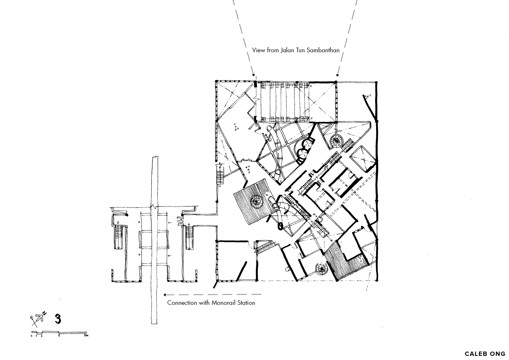
The exploration continues as the strategies applied in design sketch 2 is visualized and explored in sectional drawings, with the type of spaces, section cuts, and constraints on site responding to the site to be slowly defined and identified.
The main priority on this design stage is to create spaces with highly varying space conditions and views around the places to encourages coworker to hot-desking around the different part of the building, thus improving the dynamism of the movement and the interaction between the coworkers. It also compliments the need for “fresh start”, the need to alternate to radically different environment to work anew at different time within the same day/week that provided varying possibility for certain events to happen within the building.
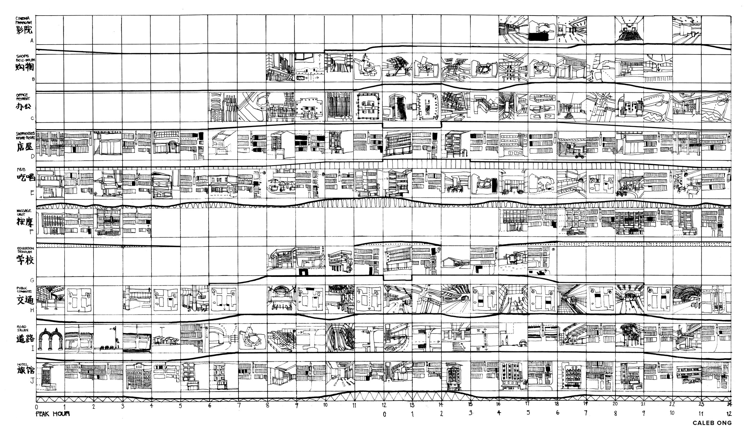
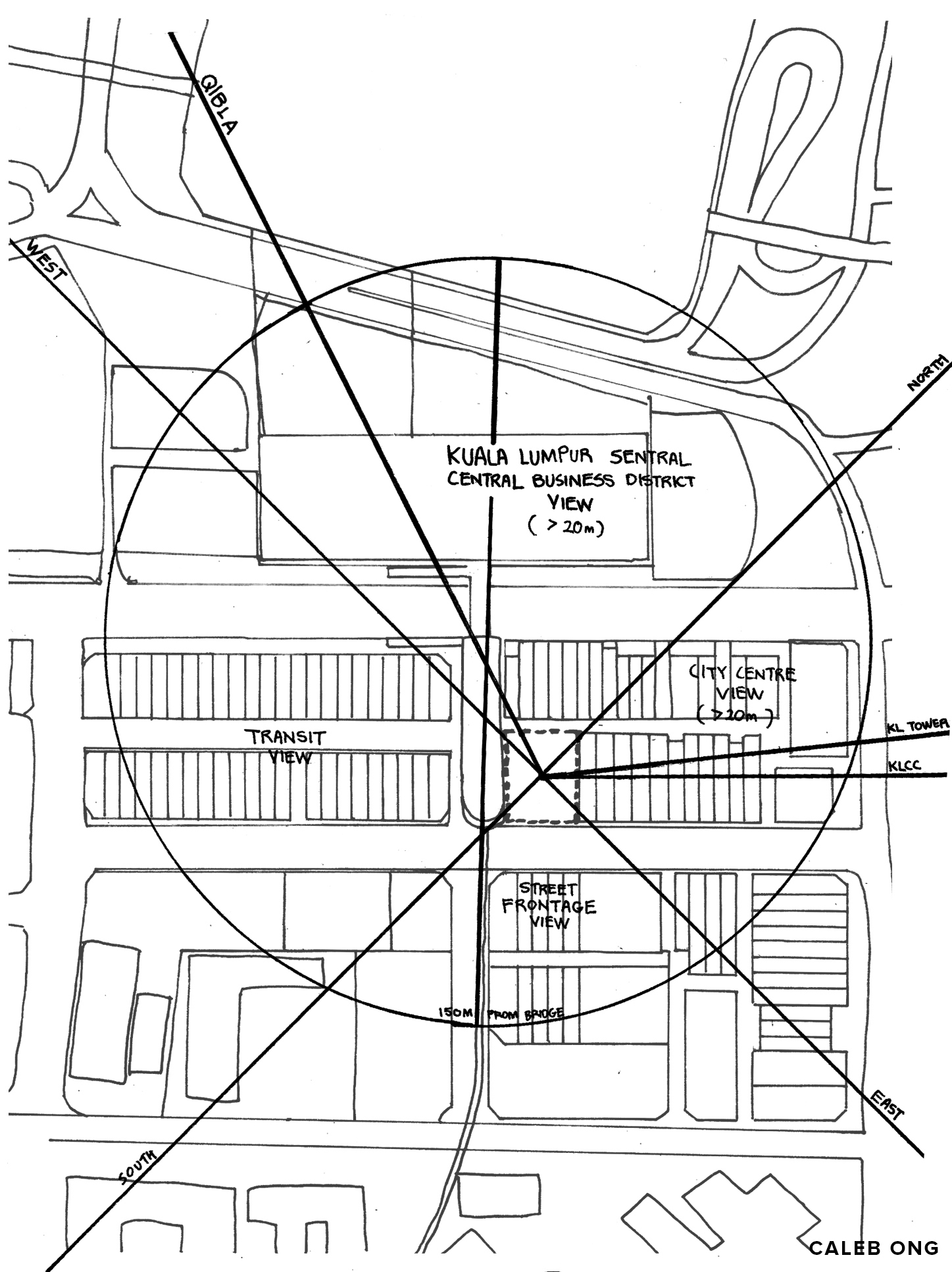
Contextual Exploration Sketch - program, space, time, movement
What are the contextual elements that could be referenced from the site surrounding onto the design and spaces?
Phase 2 design has been heavily influenced by this contextual exploration and was later dropped from consideration as it is far too restricting on the design and is rarely relevant on providing actual user experience beside superficially associating with the contexts.
It complicates the structural systems (having far too many axis) and making the design outcomes heavily hindered and restricted. Void within the building would be reduced along with overwhelming disorder to the building. (phase 2 design)
Design Phase 2 (ADT2)
Site Axis Inter-referential Sketch
This sketch is an effort to established workable axis unique to the context in order to be referenced within the building to provide multiple axis, orientation and readings to the spaces.
It has later dropped out from the design due to it providing minimal relevance to user experience and was reduced to only the most logical and practical axis, however superficially it is, in order to achieve the design objectives.
Possible axis to be incorporated
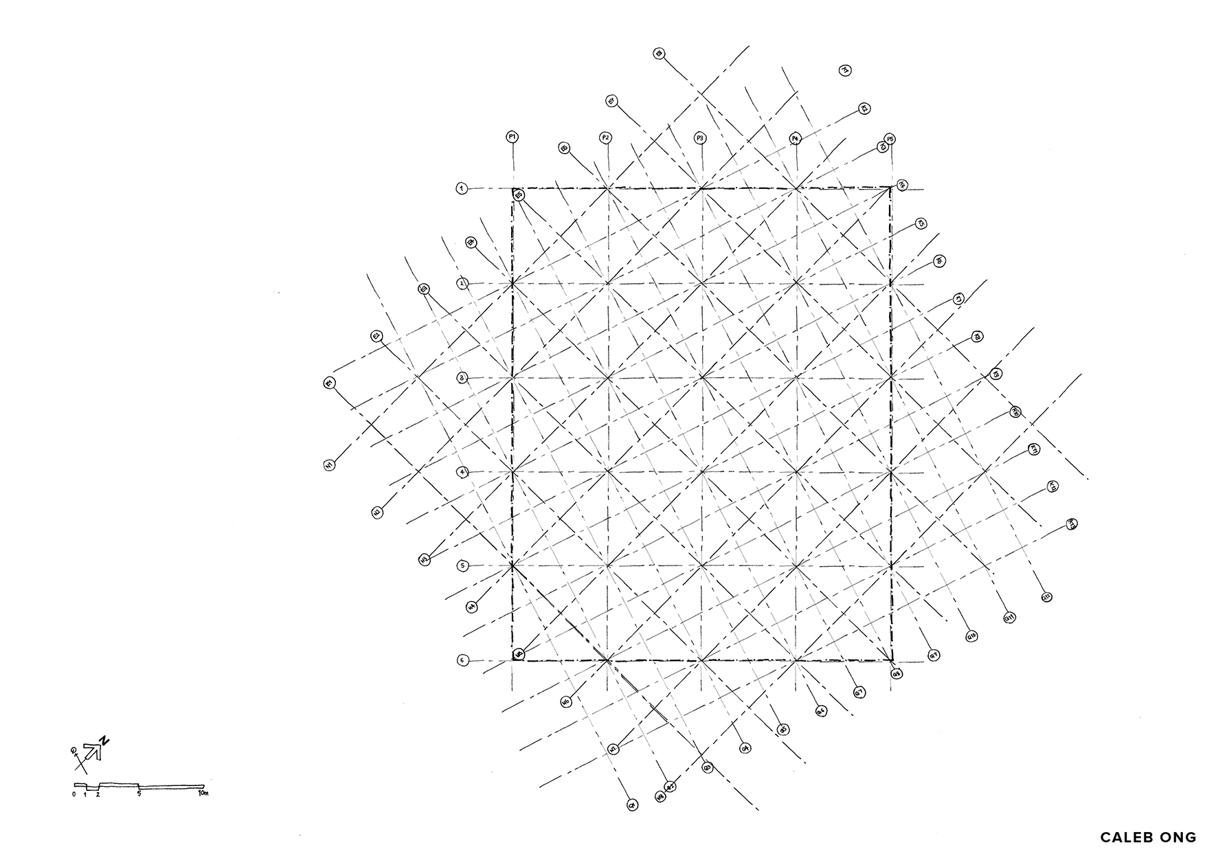
Structural Design Grid
capturing and referencing axis of:
1) Palimsest of the site boundaries (demolished shoplots)
2) North-South Axis
3) East-West Axis
4) Qibla: association for resting/praying area
The axis not only functions to provide multiplicity of meaning and an ease of construction for its beams and wall for the scheme, it also provides multiplicity of axis for movable partition wall to be moved/installed on a daily basis that further increase the types of space conditions.
The multiple entry/axis and circulation allows different segment of the spaces with varying space condition within the same levels to be isolated, rented and utilized for any event, further improves the multiplicity of reading and unpredictability/un-determineability of daily routine for coworker.
Strategies revolving around incorporation of various axis is of response to T3:Perceptual Reading frame 3 and T4:Undefined Reading frame 1,2 and 3.
Another order among the disorder is on the equal distance(spacing) between the column on the structural grid and the floor to floor height of the building, as it is one of the strong architectural element (and also a creative constraint) of the surrounding shop-lots.
Roof Plan
Ground Floor Plan
1st Floor Plan
2nd Floor Plan
3rd Floor Plan
4th Floor Plan
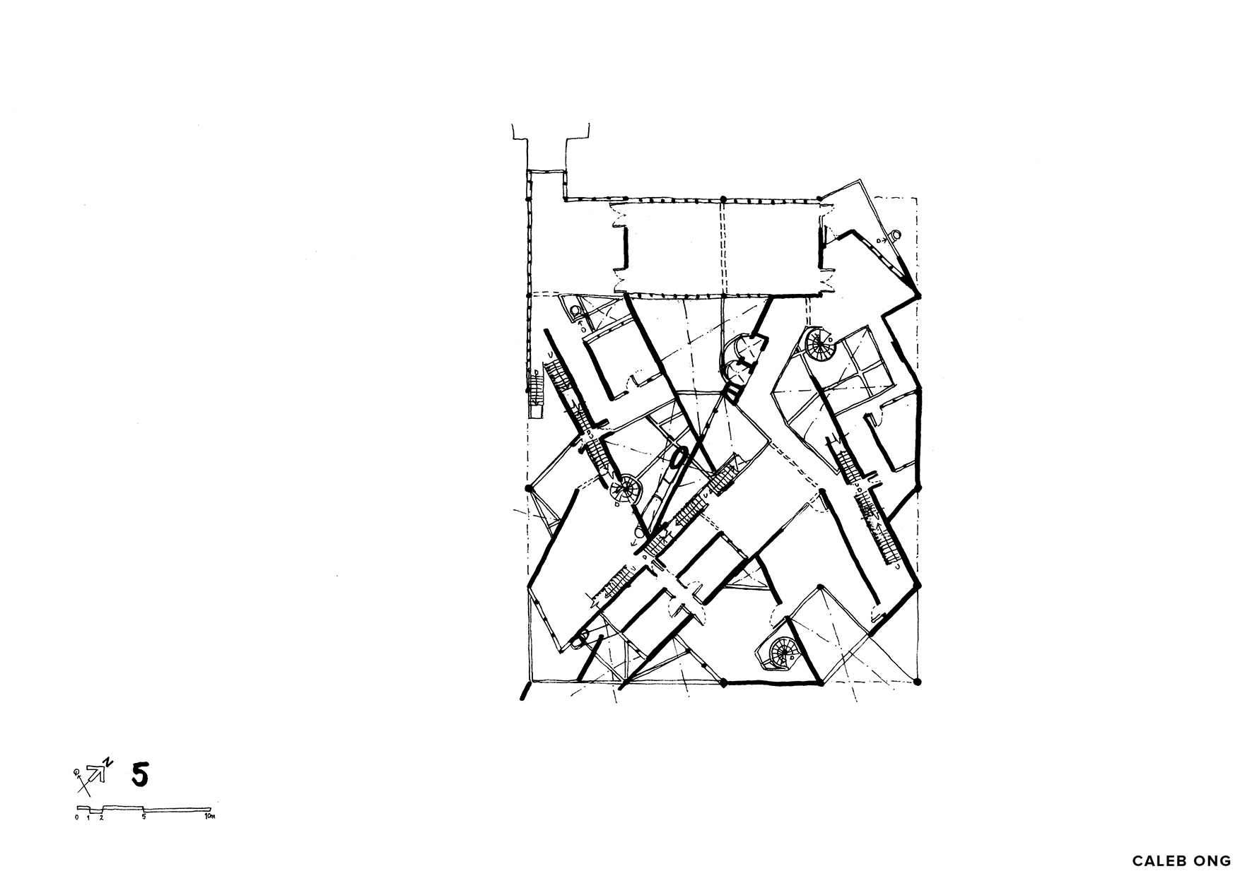
5th Floor Plan
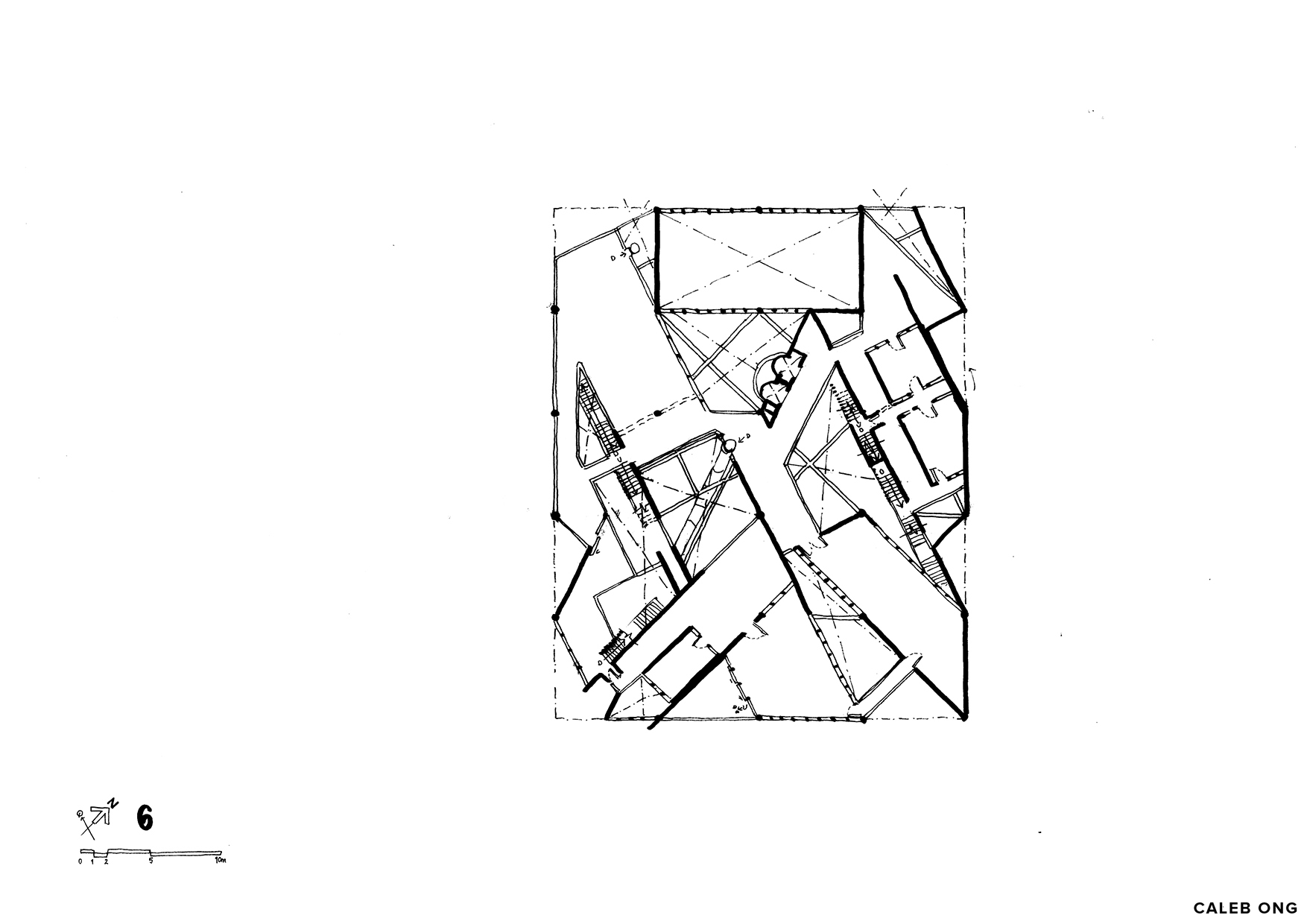
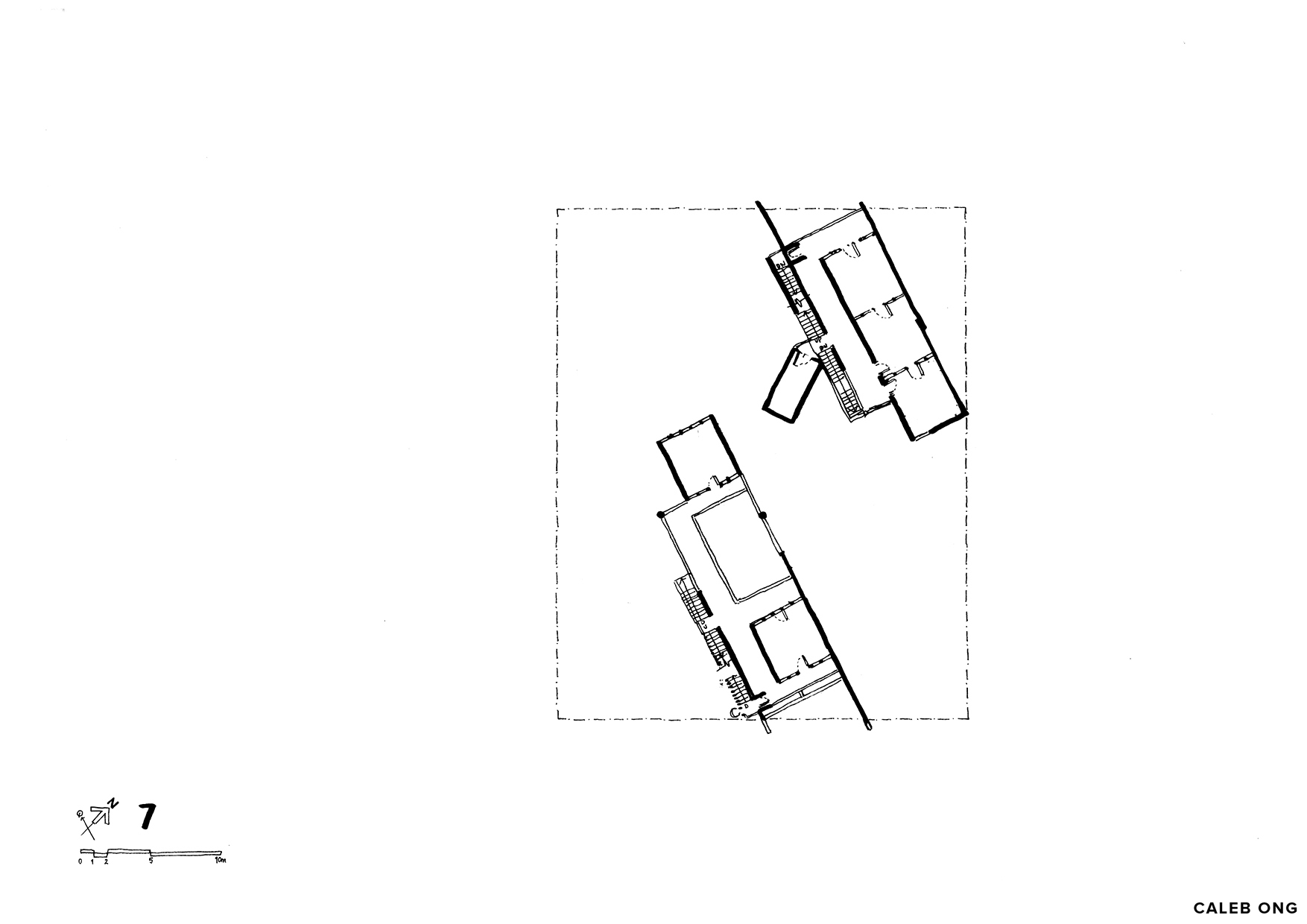
6th Floor Plan
7th Floor Plan
Front Elevation
Rear Elevation
Left Elevation
Right Elevation
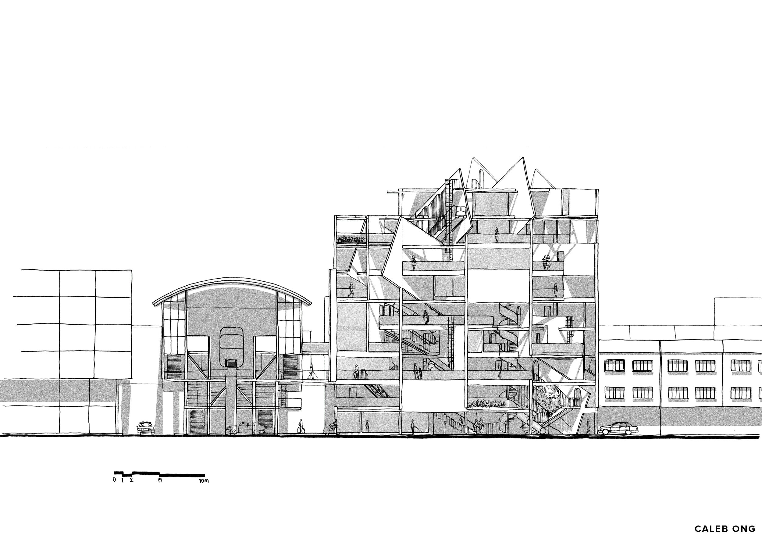
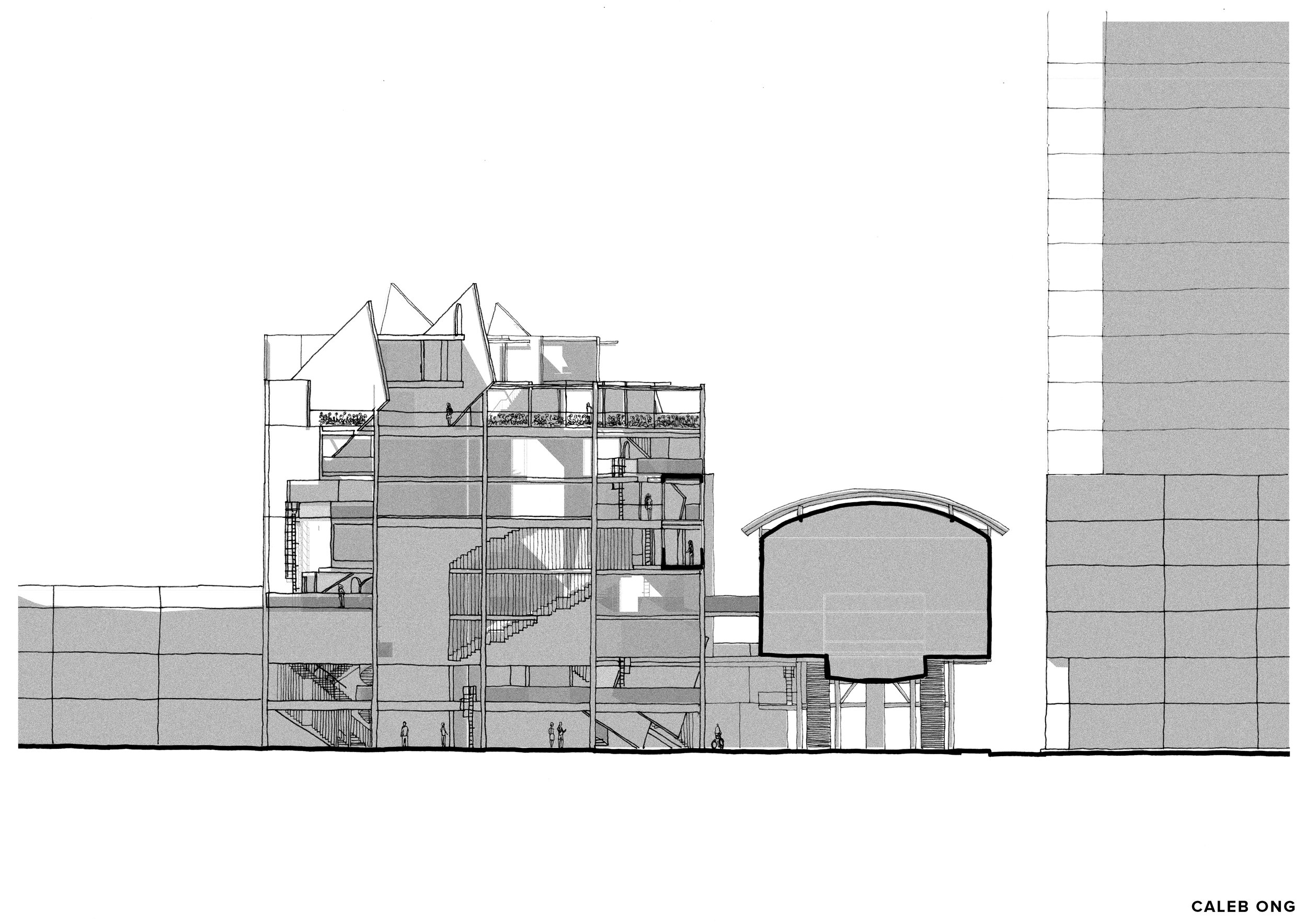
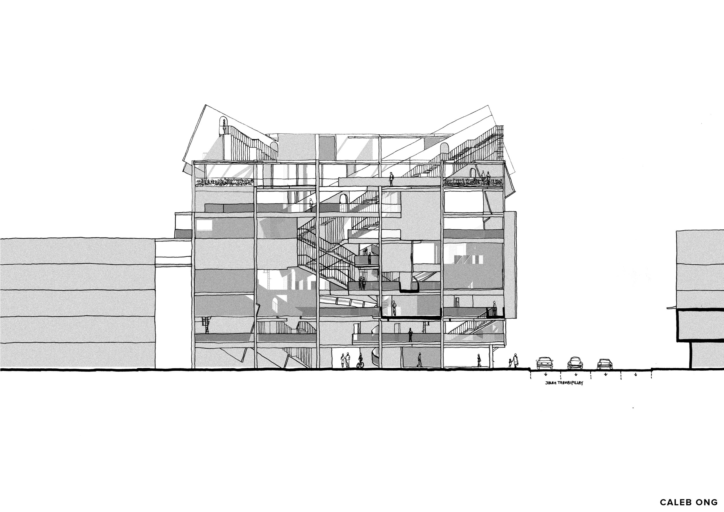
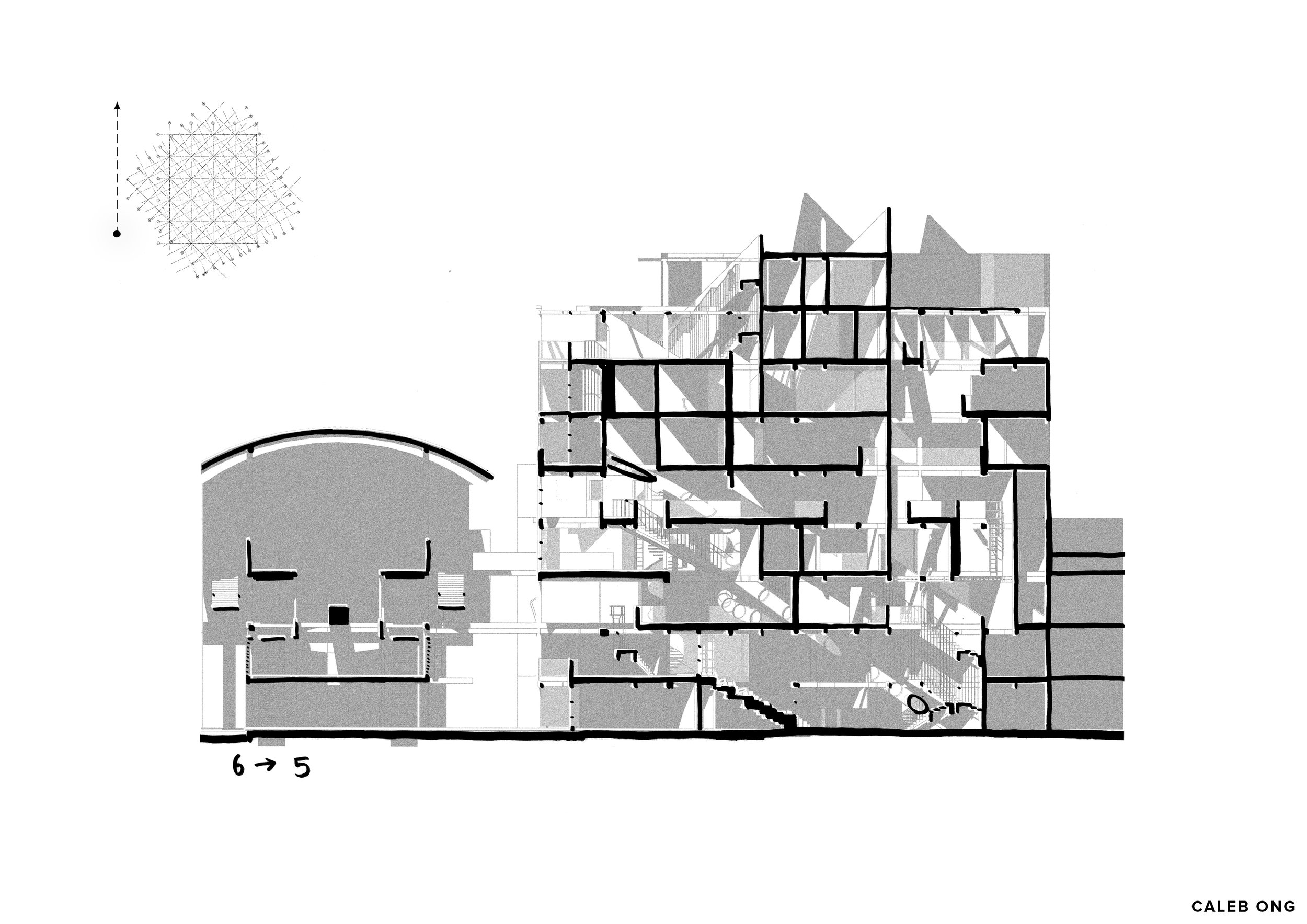
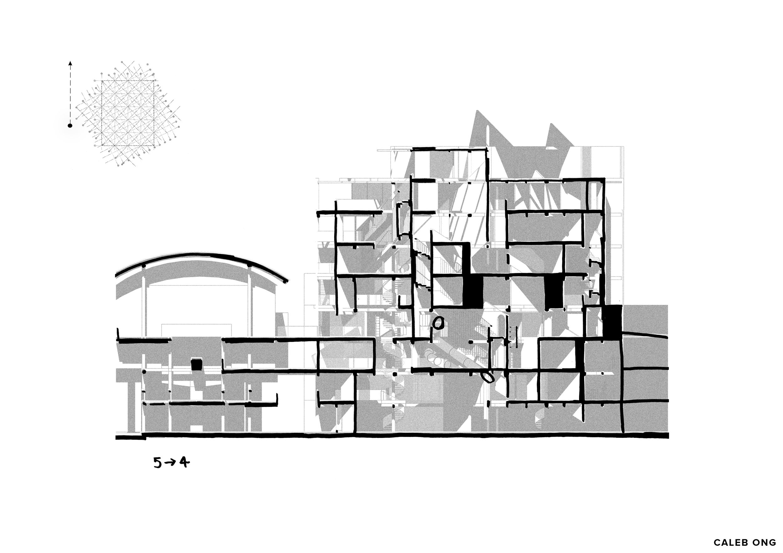
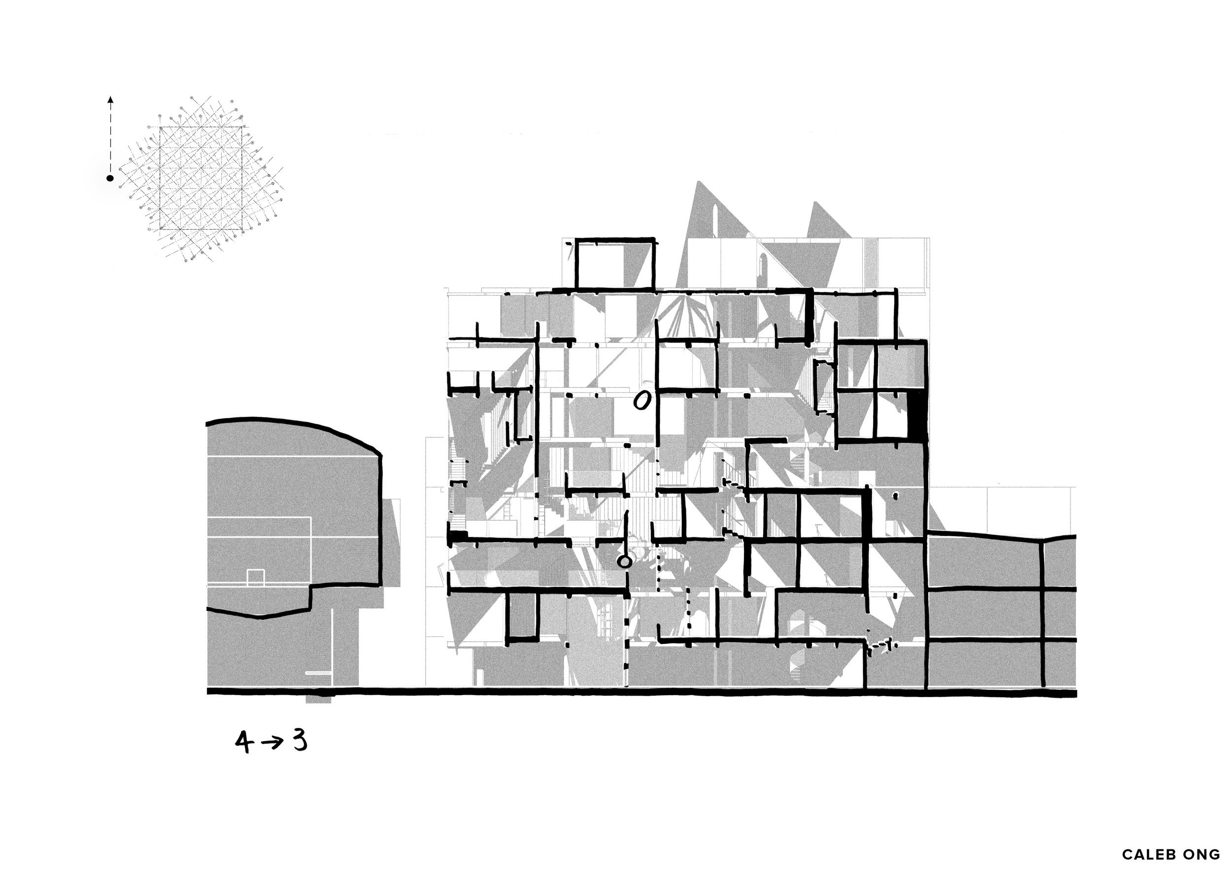
Sections
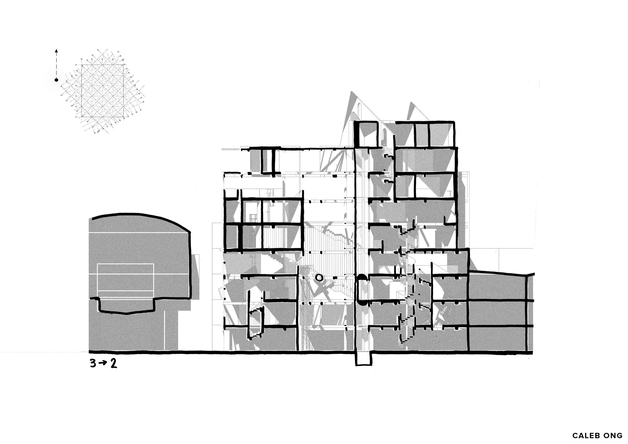
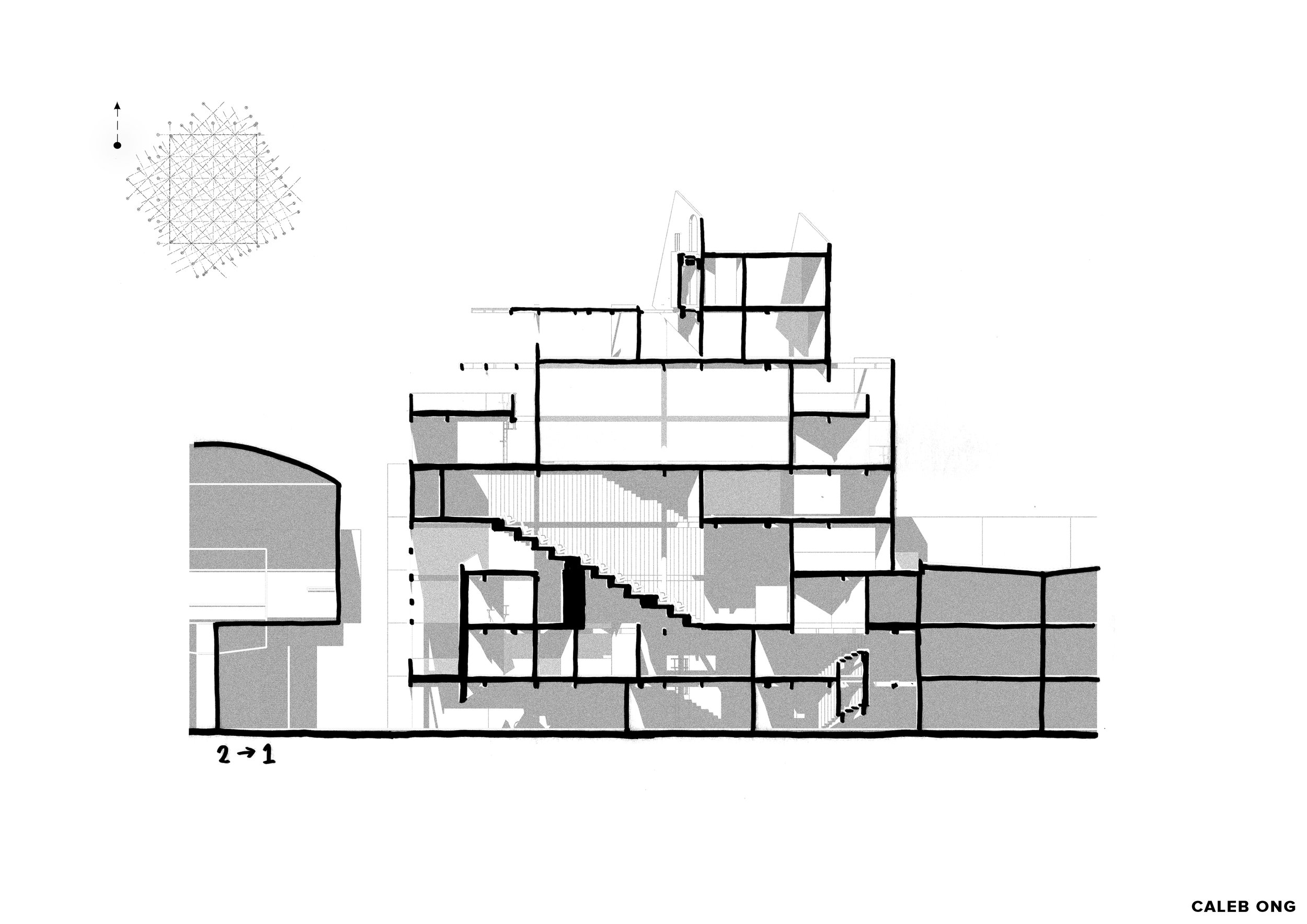
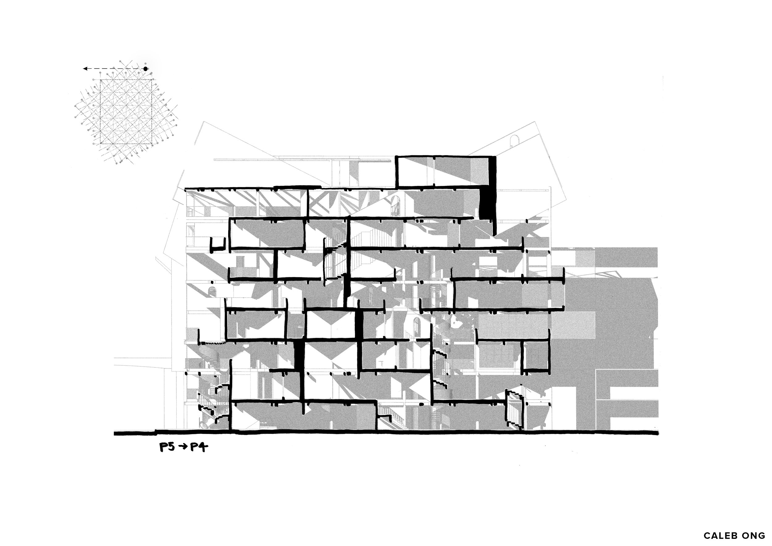
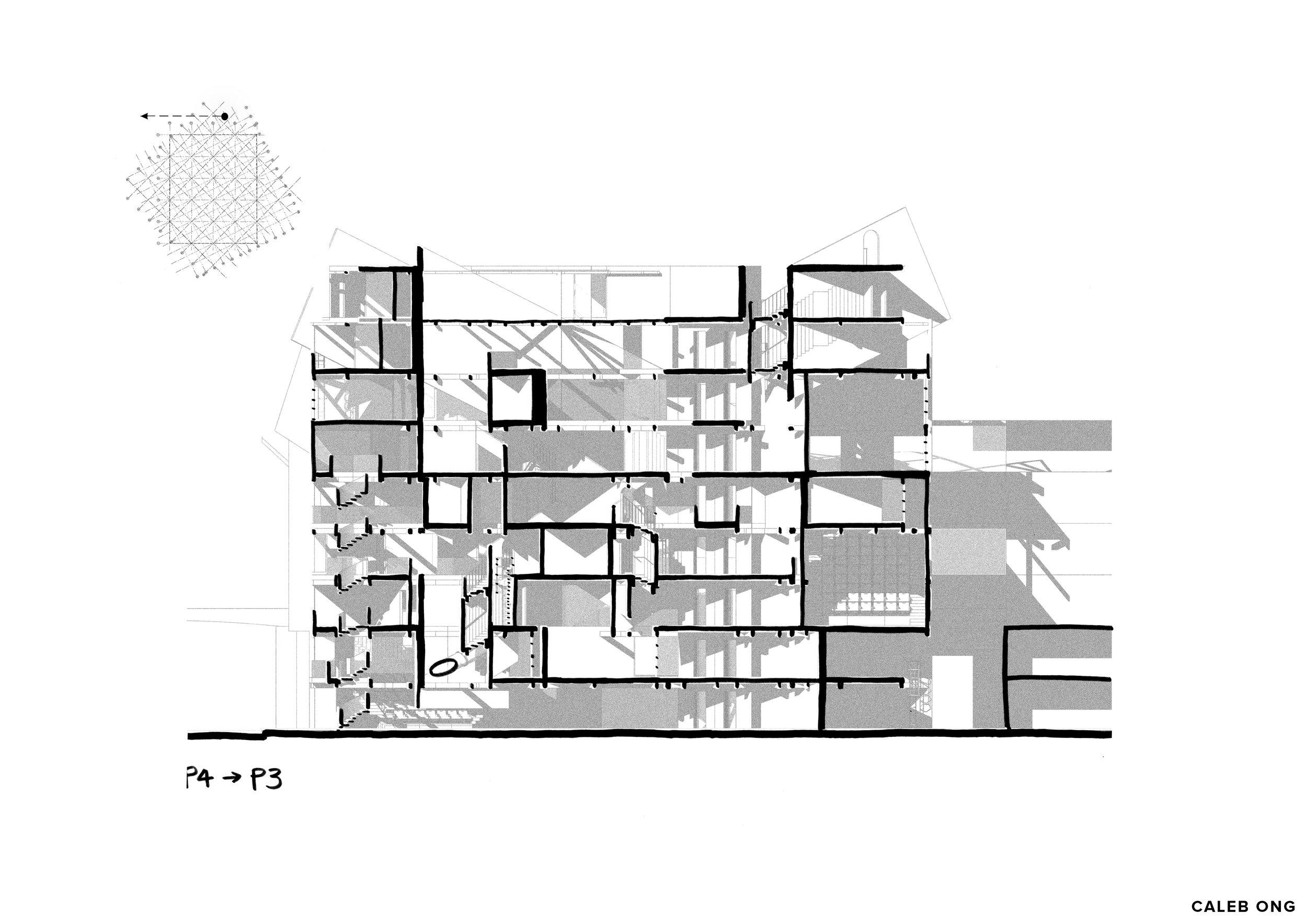
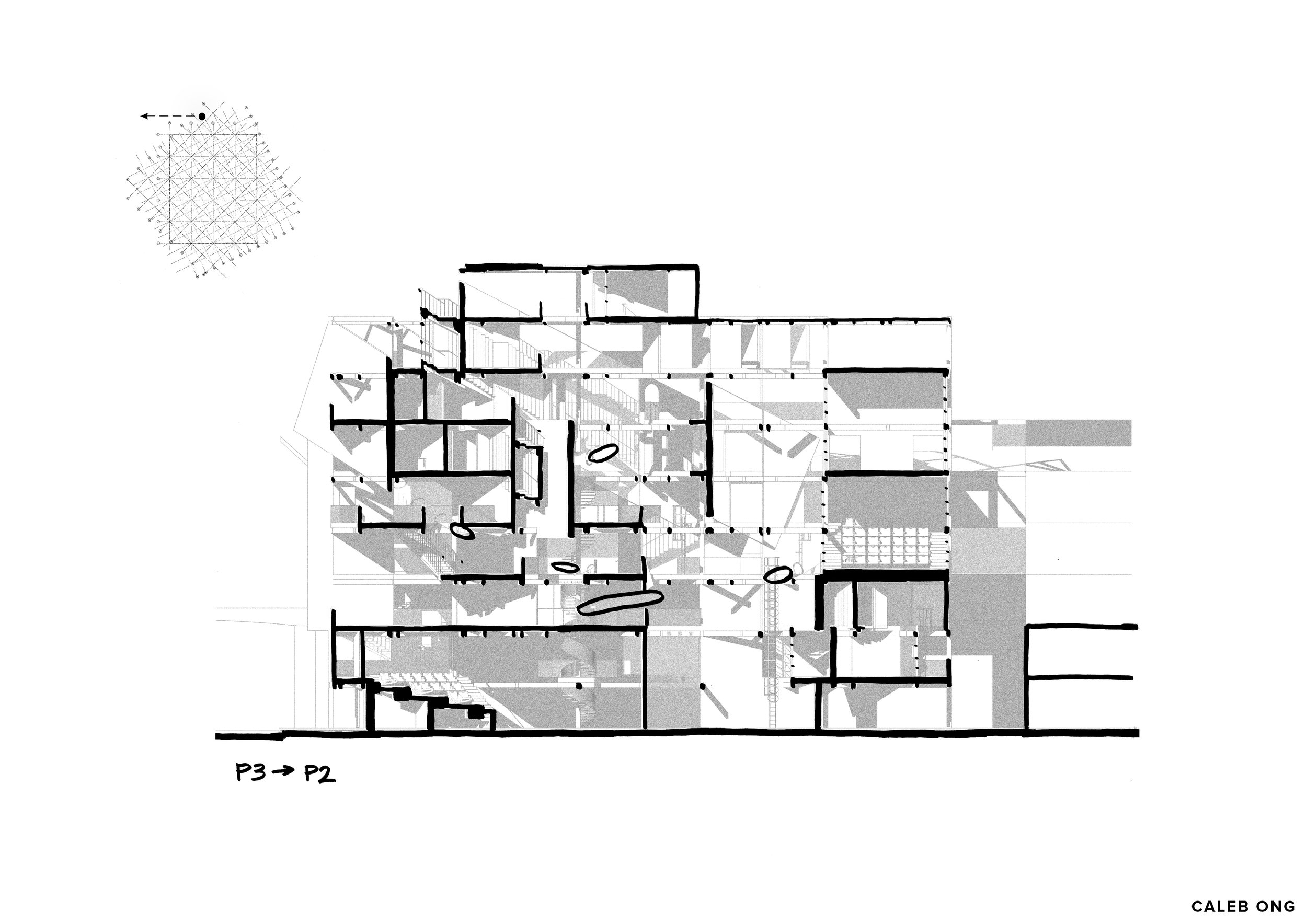
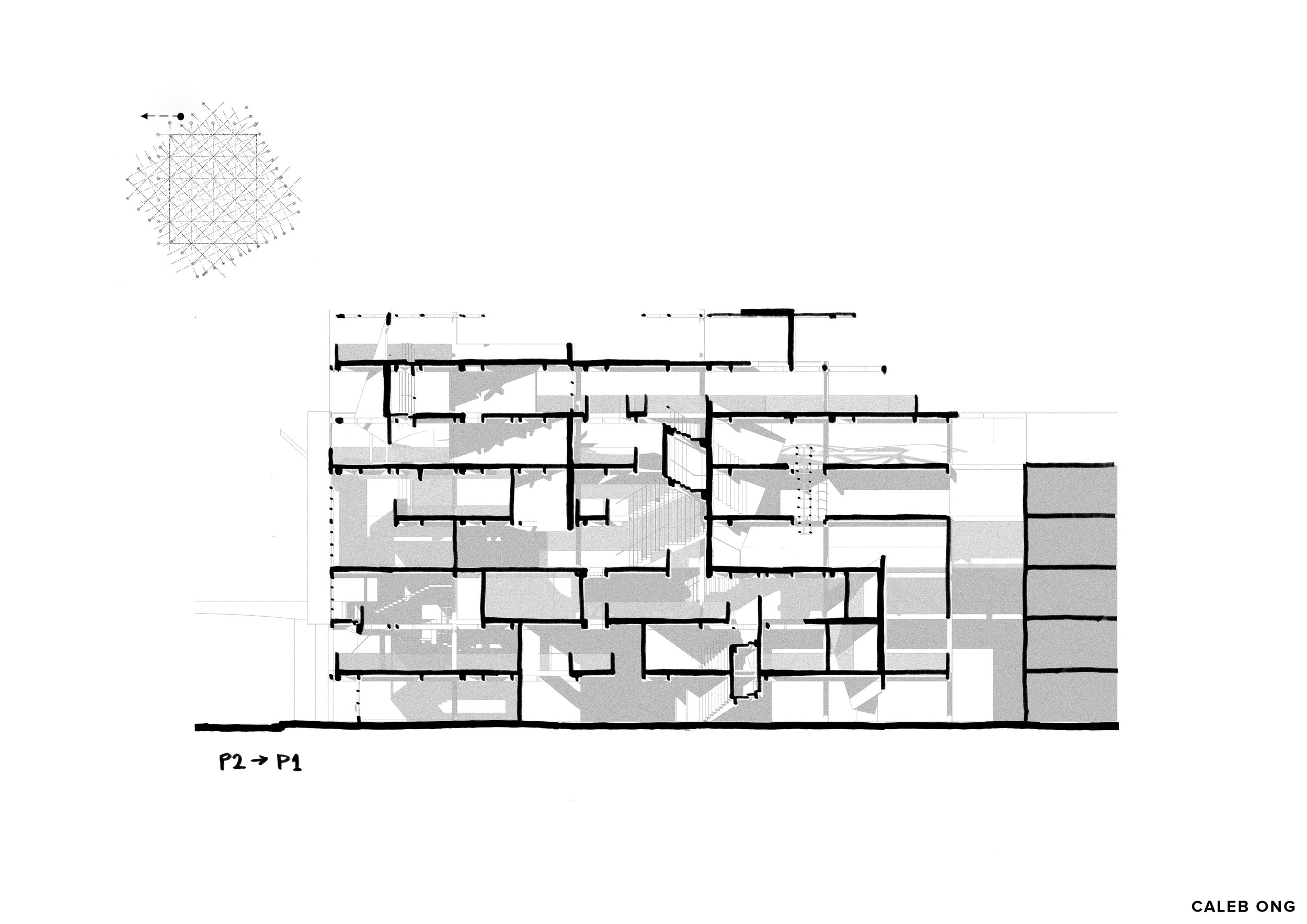
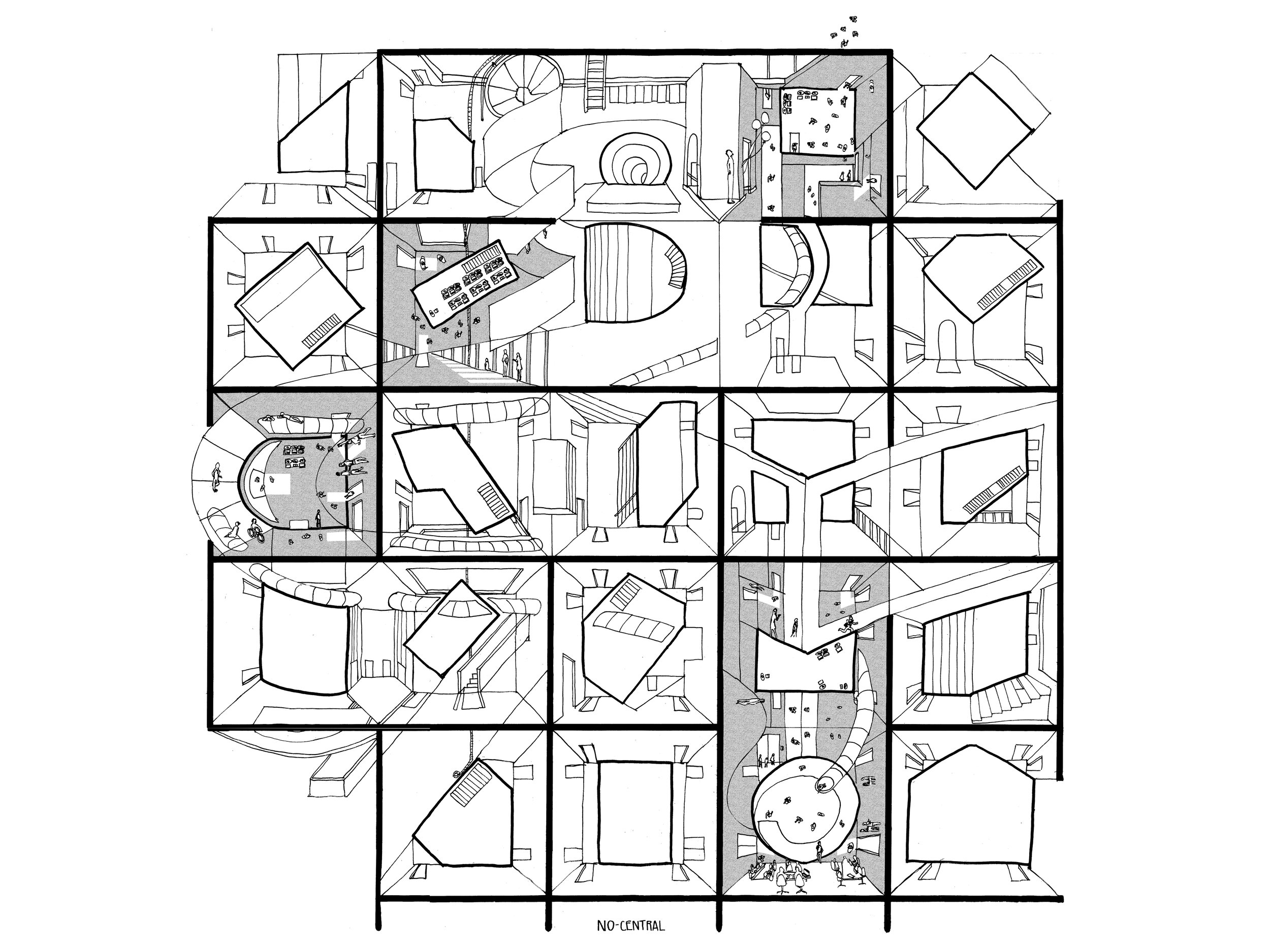
-The following are a series of sections showing the multiplicity of readings and quality of differences/changes/unpredictability/un-determineability within the building indicated by the various alternating configuration of space-volume (in height and length), across multiple cutting point on the structural grid.
-Thick big black wall indicates a diagonal wall being cut. (the thicker it is, the more tilted it is towards the viewer)
-single/double/triple storey volume
dots, short lines, long lines
short wall, tall wall
arranged as alternating as it could be, along with the various type of circulation and event suggestible/anticipated by the spaces.
-and once again, any slanted element seen in elevation/section is a sign indicating the presence of straight flight staircase. (a pattern to navigate for vertical des/ascension)
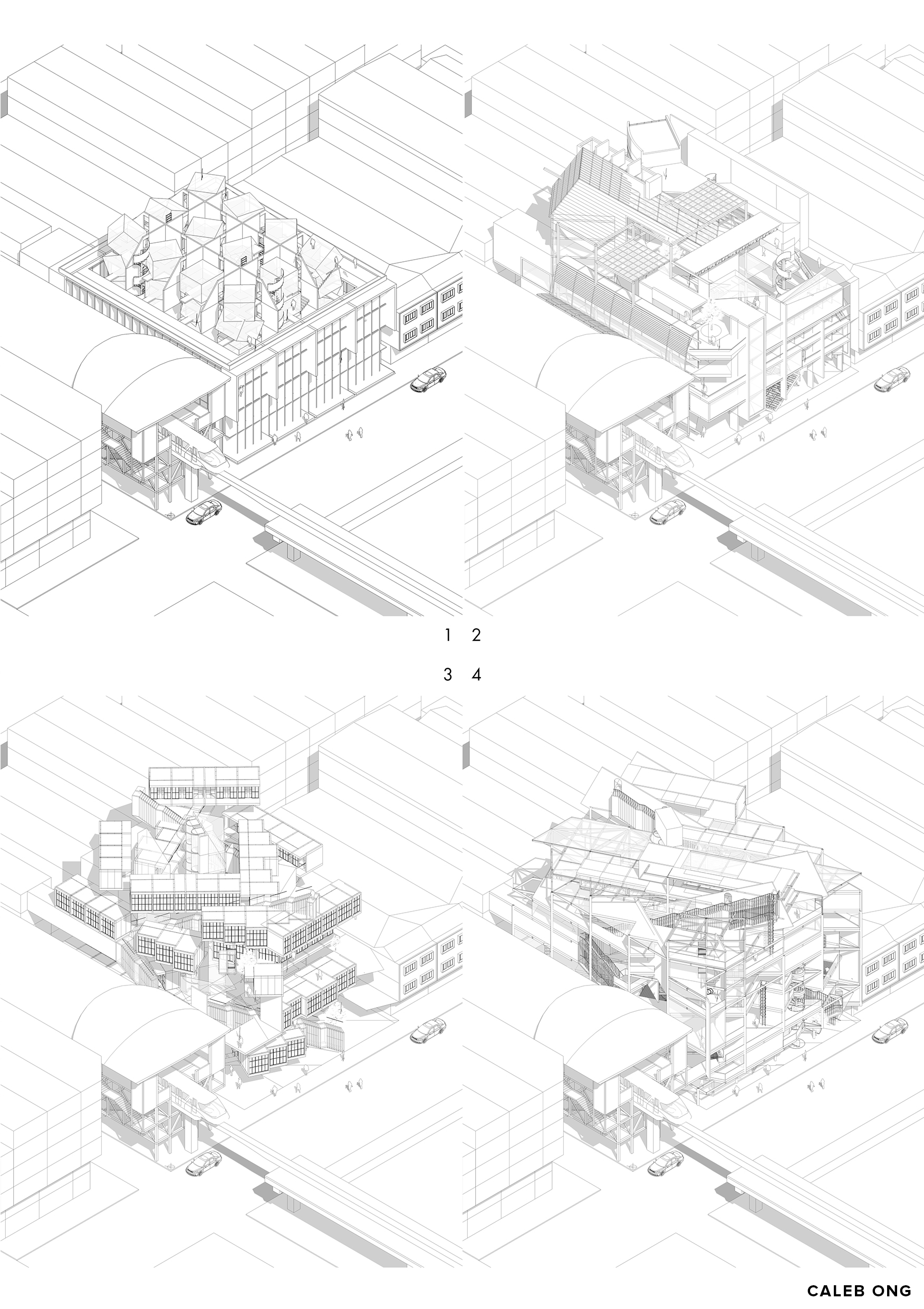
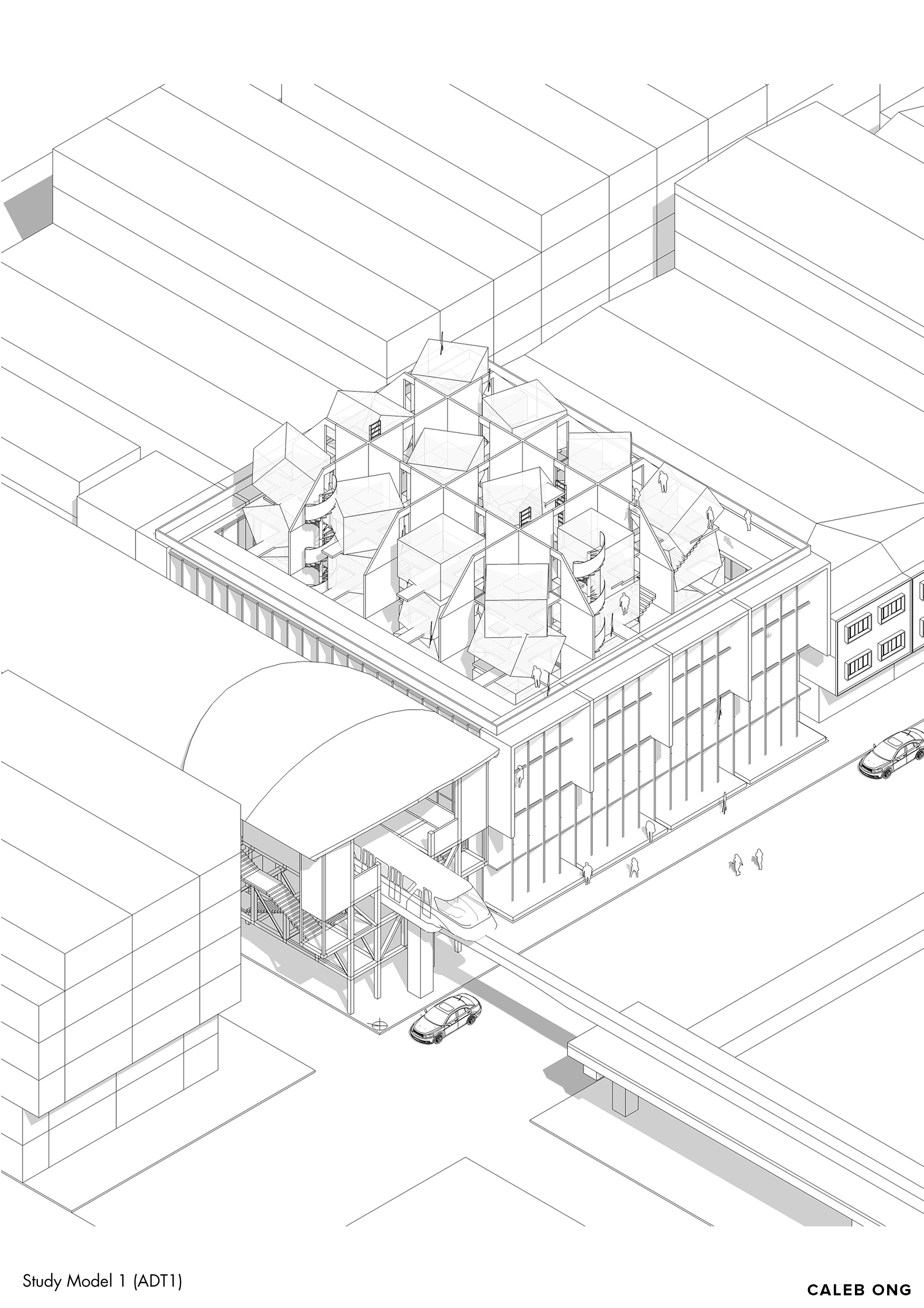
Design Phase 1 (ADT1)
Design Phase 2 (ADT2)
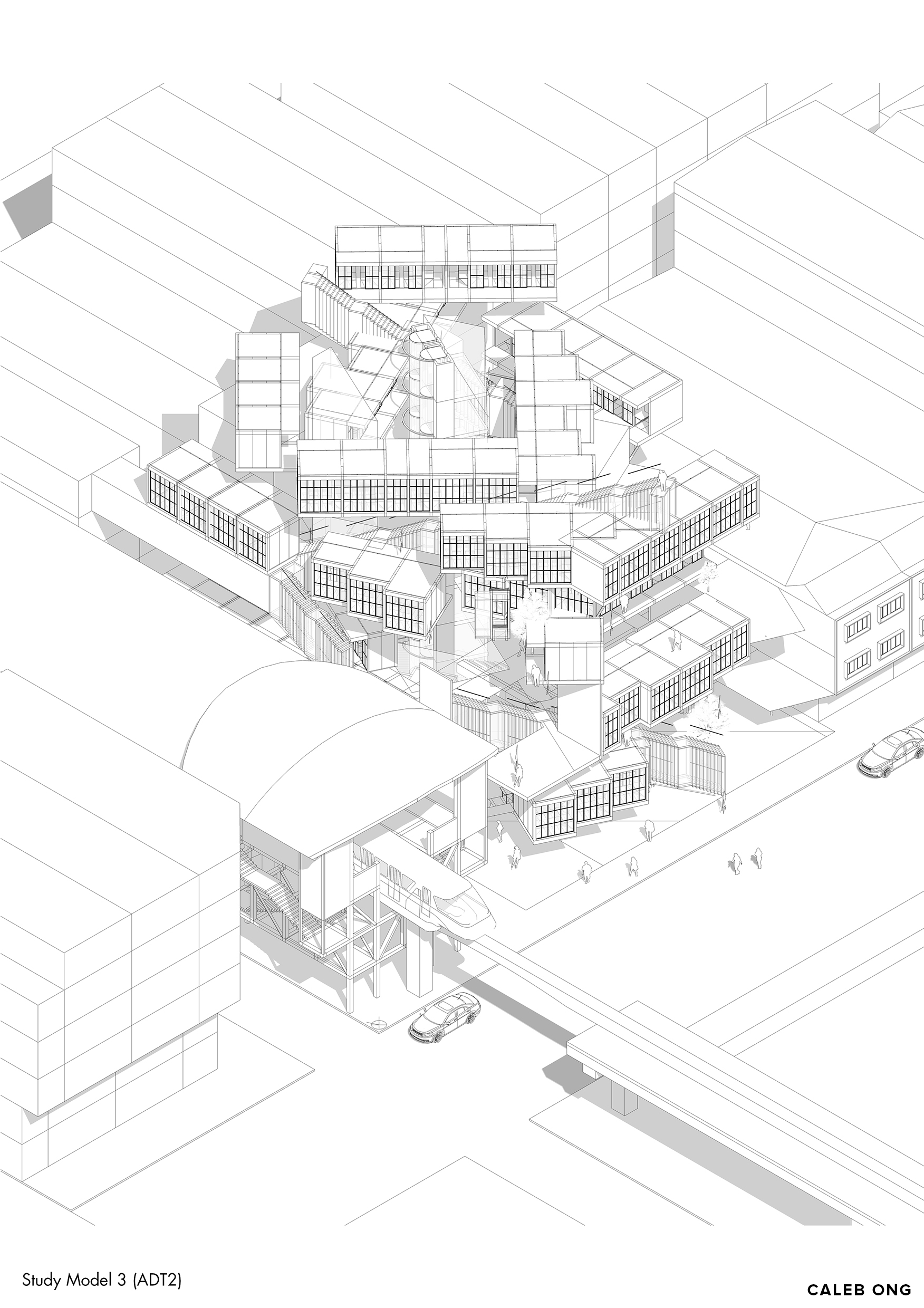
Design Phase 3 (ADT2)
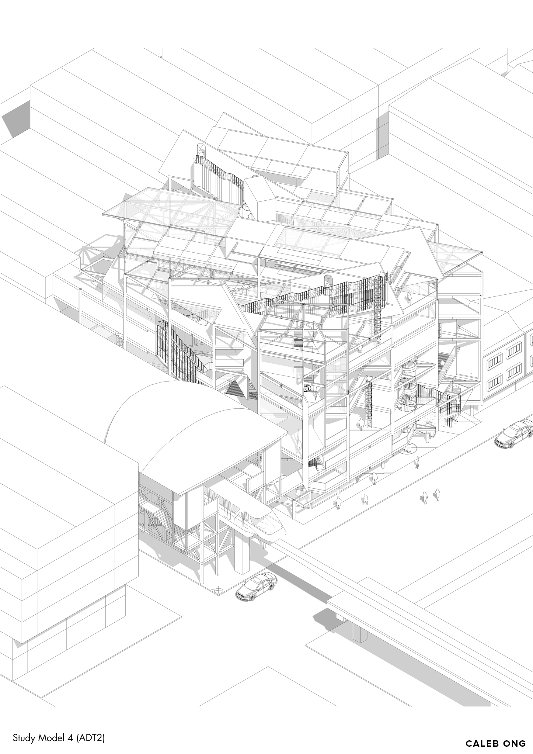
Design Phase 4 (ADT2)
More process coming up soon!
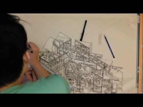
The Unending Square - Isometric Time-Lapse
PROJECT INFO
Involvement : Architectural Thesis Part 2 of 2
Idea : Disjunction and Cospacing for Coworking
Location : Brickfields, Kuala Lumpur
Building Program : Coworking spaces (hotdesk and fixed), Event, Utility, Amenity, Retail, Storage and various servicing spaces.
Gross Floor Area : 6300 sq.m.
Date : July 2018
Supervisor : Ar. Lee Cherng Yih @ http://www.formzero.net/
More detailed process about the design and the making of the drawings to be updated in the consequent weeks here and Instagram! >> https://www.instagram.com/calebongyw/
Wished to be able to write down and document the thought process, challenges, and experiences I face undertaking this architectural thesis in detail soon.
If there is any question regarding the thesis project or is there any aspect I could improve on, do leave a comment here or pm me. Hope the post is helpful and thank you for visiting!
The project is also featured in the following pages:
Drawing of the year 2019 by Archisource:
https://archisource.org/drawingoftheyear2019/winners
One Drawing Challenge 2018 Finalist by Architizer:
https://onedrawingchallenge.secure-platform.com/a/gallery/rounds/6/details/4800
Honorable Mention and shortlisted in Top20 for Tamayouz International Graduation Project 2018 Award:
https://tamayouz-award.com/tamayouz-international-graduation-projects-award-2018-winners-announcement/
Finalist of NON Architcture Competition (Alternative Designs for Offices): https://www.nonarchitecture.eu/portfolio/the-unending-square/
Drawing in full resolution available to be downloaded at: https://drive.google.com/drive/folders/14sqbordkgD2vqWq4y9hpG8zMSQutWpQ8?usp=sharing
Instagram Feed
-
December 2020
- Dec 25, 2020 Ground Zero Dec 25, 2020
-
February 2019
- Feb 24, 2019 F3 Feb 24, 2019
-
July 2018
- Jul 20, 2018 The Unending Square Jul 20, 2018
-
December 2017
- Dec 29, 2017 No-Sentral Dec 29, 2017
-
July 2017
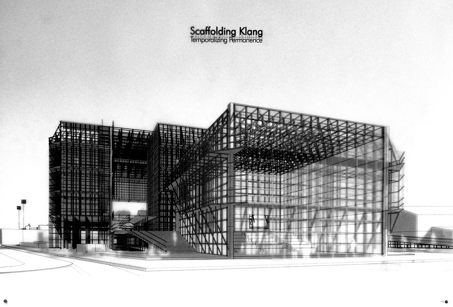
- Jul 28, 2017 Scaffolding Klang Jul 28, 2017
-
January 2017
- Jan 30, 2017 Aspects of Origination Jan 30, 2017
- Jan 20, 2017 Spotlight Jan 20, 2017